DS106 tales is up and running….scared.
An assignment went up about DS106 as a Stine book and I had never heard of Goosebumps! I confess I love horror as a genre, for reasons to explain another time. So, I went to mother google for answers.
As I think this may be an assignment UMW students do when course formally starts at the university, I am outlining my process in detail in this post. I personally prefer how-I-did-it-posts that offer clear bullets (bullet points that is), so I am doing that here. As bullets in this case imply an order, below is a numbered list of what I did and another one about what I would change. Start self-assessing your work early, boys and ghouls, best way to learn. If I could press rewind and redo: What would I change? Makes it easier for others to make improvement suggestions too!
What I did
1. Find out what these books are on Wikepedia
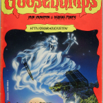
2. Google ‘Goosebumps book covers’ to get an idea of design assignment is after. I was taken by the notion of ‘creating an appropriate title’. I have not read the books so had to go with parsing lots of titles to get feel for it
3. I learnt there are many series to choose from, that Stine book covers are a thing and many people collect them and love them
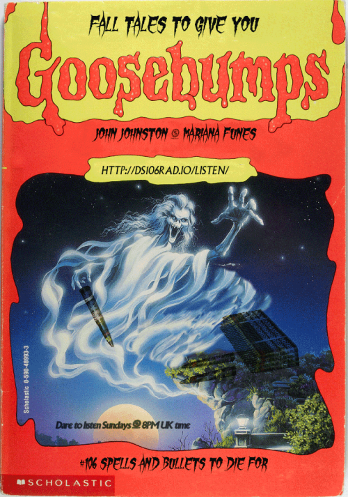
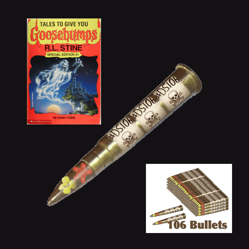
4. Found a cover that suited my purposes. Now, find a high resolution file. This took some searching but Neil came through! A true fan
5. Find font. Here one could go mad as clearly fonts had to be extreme horror. I was also searching for legibility as my purpose was to use the cover as a poster for an actual radio show. I settled for Gypsy Curse but there are so many free fonts to choose from. Just google ‘horror free font’ and be damned
6. Install font in your editor.
7. Load up all the images you want to use for the creative edit as layers in one file in your editor. I use Photoshop. #EZPZ here: File <Scripts <load file into stack
8. Make sure you know where files come from for correct attribution: My main image came from Neil, the bullets came from jjgifs in his other blog.

9. Now time to play boys and ghouls!
10. This is where the screencast would be if I was doing a tutorial. I played for a long time with Photoshop. Main tools used: Clone stamp tool to clear from original image what I did not want. Healing brush tool to tidy up. Blending option multiply to blend bullets into main background. Skew tool (used badly) to make bullet stack blend more into image. And a word of advise: always find you pink guides! Guides to align everything exist in most editor, find them. They are a life saver.
11. Now play with fonts. I used Gypsy Curse but applied several options using the cmdT option with text selected. I also used blending options to highlight text like the time for the show. For legibility I decided to use Village plain (homage to a previous DS106 run) on URL and times. Little squiggle that divides names did not exist in Village plain. Copy/paste hopefully blended the fonts a little better when added to time information.
What I would do differently
1. I need to learn how to use that Skew tool properly – I cannot get the bullets to appear as if they are lying on the rock
2. Multiply was okay to blend but there must be a way to make the bullets show up more clearly
3. I spent a long time thinking about the title. The curse of DS106 Horror Show got me last night and I lost all my work. I thought of a title this morning, but I am convinced the one last night was better…the serious design point is that it mattered that in the assignment we are pointed to think about that – it is the thing that pulls the cover together
4. I decided early on not to do the back cover, I think it should be possible to create a poster with both sides of cover and I would have more space to say what is coming in the new season of the show….this has taken long enough for now
Update!

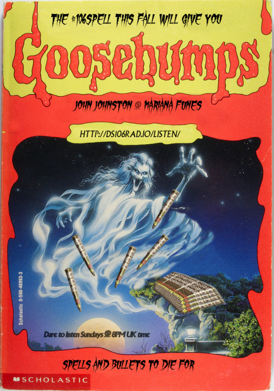
I did another version trying to improve visibility DS106 Bullets, the wording of the poster with accurate hashtag at the top and a better book title.
Finally, our new season of #106spell starts on September 6th, make sure you listen!