
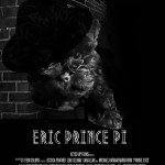
My first creative edit for #noir106. It is tough to work in black and white! Original poster by Jessica Parker, new DS106 logo by Martha Burtis, I think. And adorable puppy is Eric. Tried mixing Metropolis and Typewriter fonts to see how they blended. Enough.
Month: January 2015
long ago, long before any of us were alive or thinking or walking or breathing, when our souls were swirls, and long before the stars and the sun had any idea of what to do with themselves, there w…
This is my first #artonthecouch critique for 2015. I took a break for the holidays and have a renewed enthusiasm for this project. I have, however, made some changes for this year. I am not going to put myself under pressure to do one critique per week, last year it started to turn into a chore and I did not like that. Guilt is not part of the DS106 ethos – and I felt guilty if I missed a week.
The other interesting thing is that people are choosing to not submit any art for me to critique. Just an observation not a judgement. I have to keep choosing the art myself. So I will choose art that speaks to me and that, paraphrasing Jeannette Winterson, I want to spend time with.
Without further ado, let’s spend some time with some awesome web art!
‘Three Seasons’ is a story told in a web page; not a photo or something I can reproduce here. You have to go an read it before what follows can make sense. And trust me, it will be worth every minute you spend with it.
What first struck me when engaging with this piece was the multi-modal nature of it. This may seem a detached and technical observation, but I think that this web page shows some of the possibilities in the future of composition. It uses audio, written words, video, animated gifs in the service of the story and it does so beautifully.
I clicked to read from Twitter one day last year when I was rushing to finish my chores for the year. It made me stop and attend. It made me stop and connect with my emotions even when I did not have time for that. That is powerful.
I am a writer so my attention on second reading was drawn to the written word. I noticed that Kailey (@kaileyck) did not capitalise any of her paragraphs. She does not use paragraphs in the traditional sense either. It is as if she is using space to mark the places where she would like her reader to take a breadth. The effect on me of the lack of traditional markers was to draw me in and make me want to attend to the story that much more…I did not know where to pause so I just focussed. As you read you think you are settling into a story told in the written word and then
and then Kailey starts to work with other media and draws the reader in further. The use of the animated gif was particularly powerful. As those of you who read The DS106 Shrink regularly know, I am obsessed with the animated gif. I have a sense that it is evolving into a medium to ‘carry’ the content of our communication that is carried by body language and gestures when we speak face to face. Humans have such ingenuity when it comes to overcoming limitations. The ‘text mediated self’ that is our digital presence is limited and favours those of us who have ease with the written word. Some people, like Kailey, are creating a new language. We all need to ask ‘do you speak gif?’ and Kailey shows us how. The animated gifs in her piece bring the written word to life. They are done beautifully: smooth precise moments picked meticulously to add to the words.
And just as you start to think that this is it, she adds sound. First in the form of a dramatic video clip, which makes us transition from the visual element to audio and then to audio only. This to me is what lifts this story from the just good to the simply exceptional. I click on the audio file and keep on reading. Just the same attention to detail as in the rest of the story. The sound blends with the words as if Kailey was there telling me the story and playing the sound on a piano. It keeps playing as you read. Foley sounds create images in your mind as you read the words
and your emotions engage with the words in ways that plain text could never do. I read to the end and have tears in my eyes as I finish reading, hearing, seeing Kailey tell me a story.
I think you can say, British understatement coming, that I quite liked the story.
My critique has focussed on form not content because this is what struck me the most and what connected with my own interest in mediated communication. Yet none of this would work without a beautifully crafted story. Do yourself a favour. Switch on clutter cloak and spend a day in Kailey’s company. It will restore your soul.
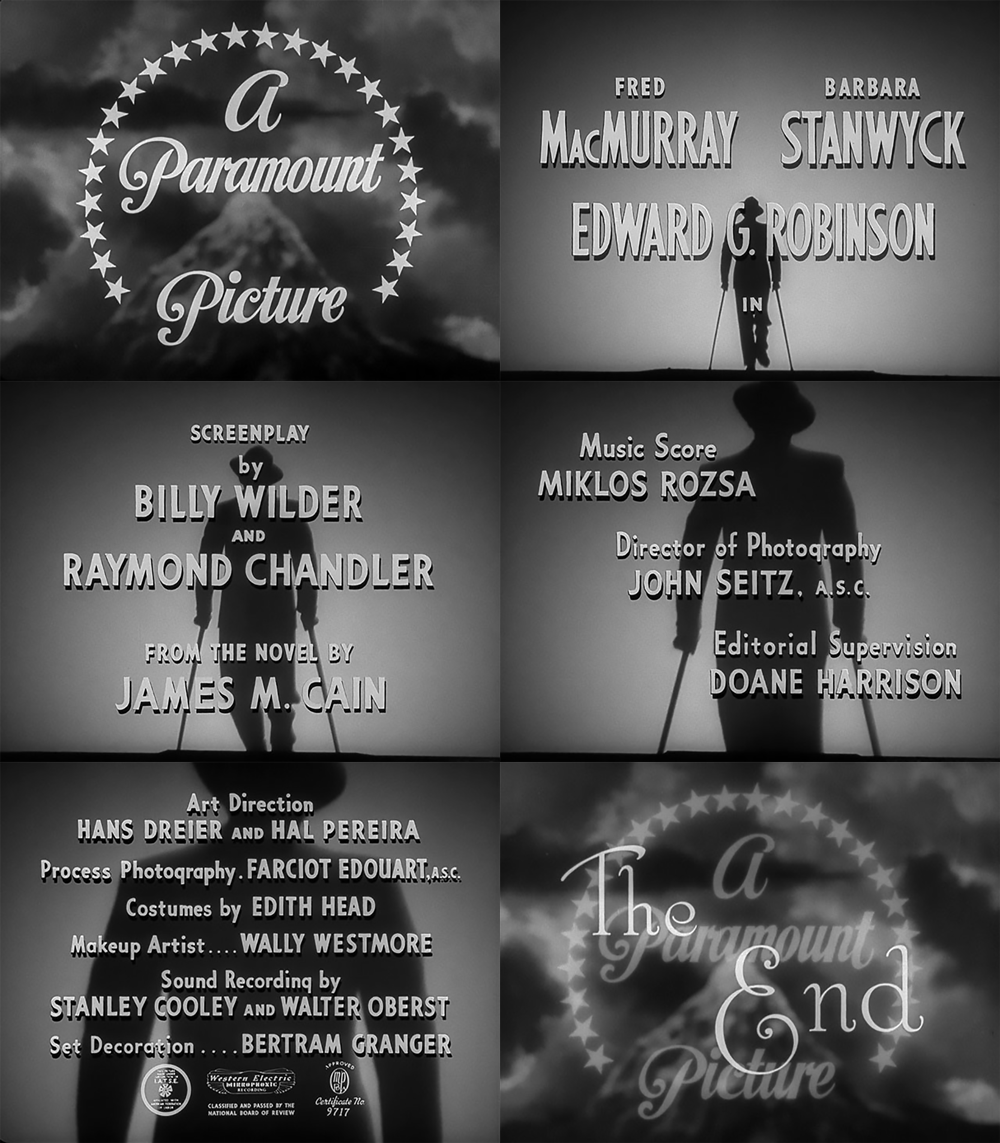

Here is the HD at Gfycat worth a look!
So, I am starting to explore Cine Noir for this run of DS106. At the risk of being burnt at the stake, I am not interested in watching the films! Yet, I love the style of them and the way in which ‘the sets and atmosphere reflect the characters inner turmoil’ or so I read in my overview google dive last night. I also love the typography and how it uses the form to express the emotional tone of the story. It is surprisingly difficult to find out detail about the original types. I have found two fonts that I want to play with: Metropolis and Stroke. It looks like Typewriter can also be used. So how do you get the ‘noir feel’ to an animated gif? Best way to see that was to make one from one of the most famous film Noir I know! Use of light, high contrast and that closed in vignette around the image. I noticed also that everything seems sharp and clean – clothes, posters, people and typography. I like that. How the figure gets closer and closer….scary!
I know nothing about Cine Noir. I now something about Tech Noir as most of my favourite films are about dystopian futures.
There is a lot to learn and, heads up, creative edits of Cine Noir posters will be a pig of a job to do!
The how of this gif will have to wait for now. The joy of being an open participant, no deadlines!
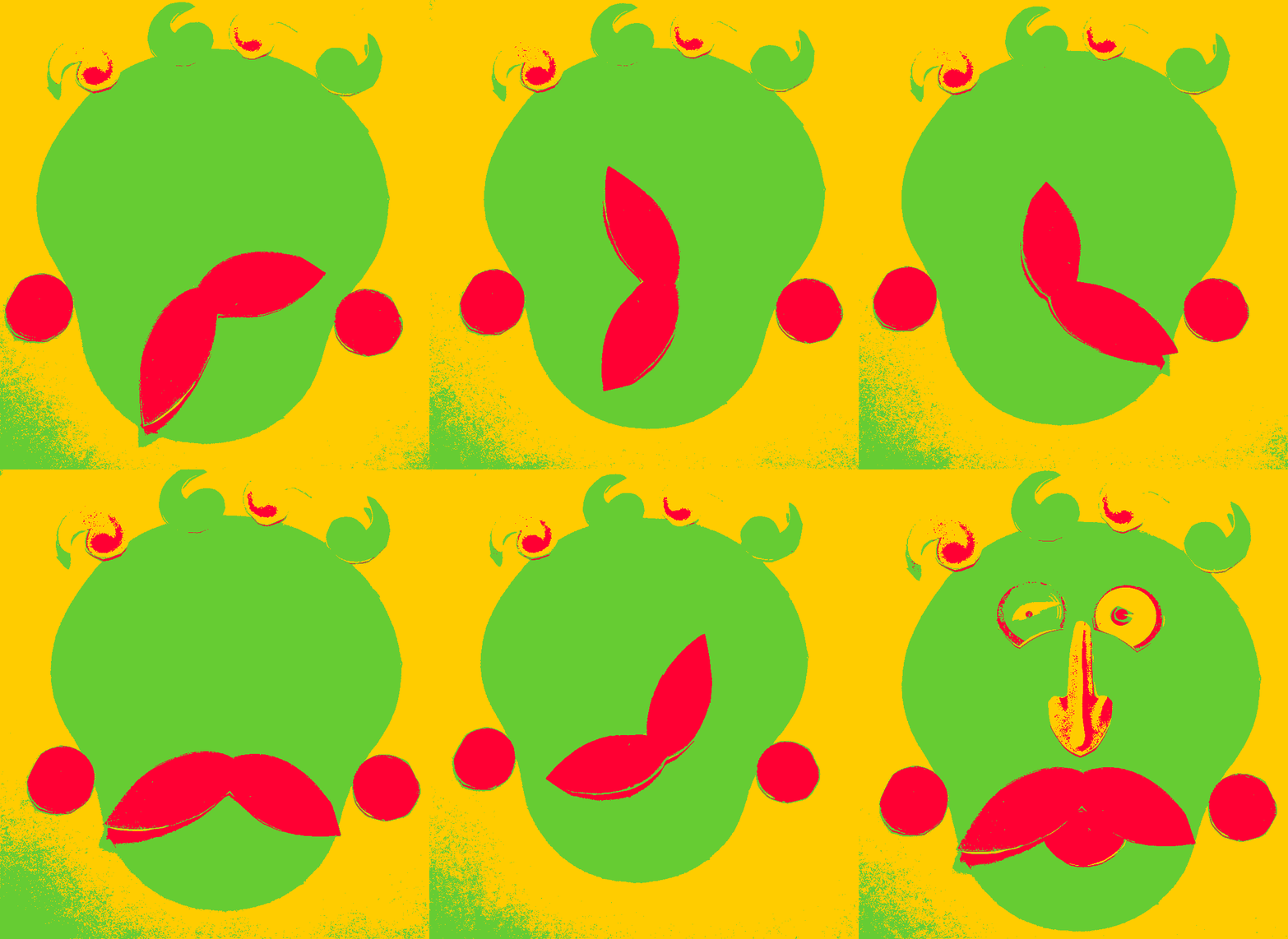
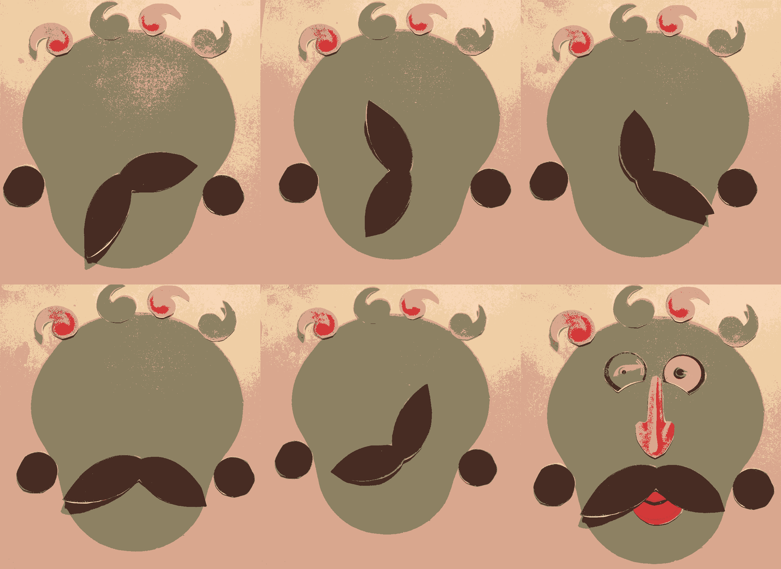

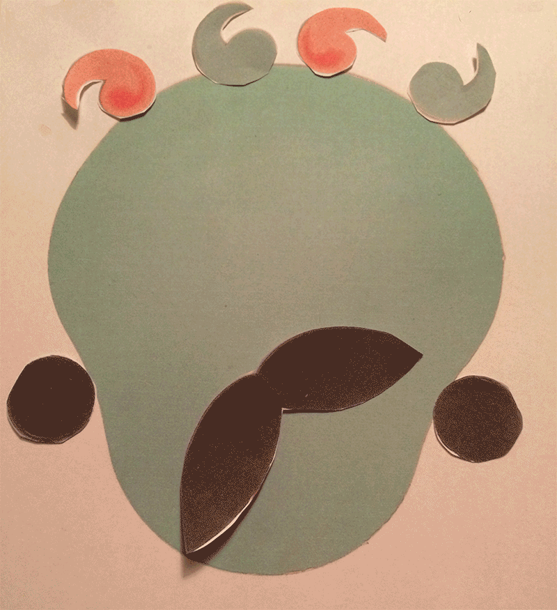



This one was too hard for gifadog!
It needed cutting up and glueing and his little paws can only use a mouse so far, so the Shrink had to step in and help. I am pretty proud of this one, it feels like (dare I say it?) I actually made some art, damn it!
It had to be done. I am so sorry.
It started with a DS106 daily create, of course. I then saw this precious little gem from Kathy Onarheim which reminded me of Brian Bennett’s excellent ‘Roll it Baby!“ and then I remembered ‘The most boring mash up ever’.
The scene was set. The most boring plumbing commercial ever had to be remixed. I have been giggling for the last hour whilst making it, worth the smile I reckon.
(Source: https://www.youtube.com/)