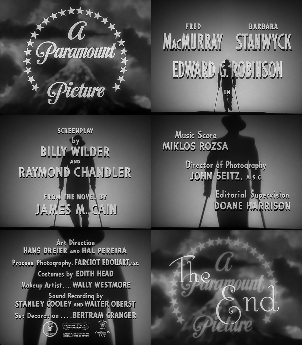
Here is the HD at Gfycat worth a look!
So, I am starting to explore Cine Noir for this run of DS106. At the risk of being burnt at the stake, I am not interested in watching the films! Yet, I love the style of them and the way in which ‘the sets and atmosphere reflect the characters inner turmoil’ or so I read in my overview google dive last night. I also love the typography and how it uses the form to express the emotional tone of the story. It is surprisingly difficult to find out detail about the original types. I have found two fonts that I want to play with: Metropolis and Stroke. It looks like Typewriter can also be used. So how do you get the ‘noir feel’ to an animated gif? Best way to see that was to make one from one of the most famous film Noir I know! Use of light, high contrast and that closed in vignette around the image. I noticed also that everything seems sharp and clean – clothes, posters, people and typography. I like that. How the figure gets closer and closer….scary!
I know nothing about Cine Noir. I now something about Tech Noir as most of my favourite films are about dystopian futures.
There is a lot to learn and, heads up, creative edits of Cine Noir posters will be a pig of a job to do!
The how of this gif will have to wait for now. The joy of being an open participant, no deadlines!


Leave a Reply