DS106 on the couch

Author: DS106 on the couch (page 3 of 34)

An interesting Daily Create today.

It talks about an old song that I knew as by Joni Mitchell though it turns out  somebody called Judy Collins sang it first. Who knew?  

As I listened to the song ( the Joni Mitchell version, of course) I doodled a cartoon in my sketchbook by hand. The simple idea being that you get to see both sides of the cloud if you change location (or attitude). Yet, if you take the point of view of the viewer you see that ‘truth’ lies in both sides rather than one or the other. Kind of like what the song is saying. 

I then wanted to ‘improve’ on the idea and simple sketch. I went to Strip Generator and created a comic strip there. Same idea, still simple but tidier, more words and 3 frames. I was able to use a line from the song at the end frame which may be seen as more amusing.

Just reflecting on where the creativity lies. The idea? The execution? The quality of the output? I had great fun with my wee sketch, yet it is so basic and simple compared to the digital comic strip. All I had to do to produce it was copy image templates already available and type in some text in boxes already provided by the generator. 

I really don’t know clouds at all. 

Well, I had to Storify the wonderful Daily create for my birthday.

So today the Daily Create hit 1500 daily prompts! A kind of a birthday, no? I thought I would play a little more with pixel art, I did the other day and liked it. And it is right for today’s celebrations as well! 

An open education conference I am attending in April asked us to create ‘a promo poster’ for it using our #ds106 digital skills. I am still uncertain as to what the brief is. I wonder if they want us to keep to their current theme of just make some fun posters. I went for fun posters! Others kept to the current theme – I hate that blue! 

I wanted an image that spoke of ‘open culture’ as this is the theme of the conference – I spent a long time searching in Wikimedia and other spaces for public domain images that were free to use. Found one. 

Poster 1

I also was not comfortable with highlighting keynote speakers as the ‘main event’ – for me the main event is about the whole community coming together to search their ideas and research. I wanted the poster to be about the perspective of a potential participant thinking about attending. The one way ticket idea, spoke to me in terms of how once you become an open online educator ‘there is not going back, it is a one way ticket’ – in one’s heart, at least. The tag line kept ringing in my head, it is probably lyrics to a song I heard long ago.  The Delicate font I found recently and love the open and minimal nature of it, it seemed the obvious choice. As the poster was a non-english movie poster the credits are in a language other than English, I chose to leave that as it was as it highlighted the idea that conferences are not (or should not be?) about personalities but about egoless dialogue. The poster highlights the theme and the participant – that is all. The image give the sense of endless ocean, marking the potential of ‘open culture’ in education. I love the simplicity of this one. 

Poster 2

I did the traditional thing and followed a template. The ‘movie’ has stars and they will pull the punters in. The stars at the top, the potential participant and his thoughts lower down in the image, with a smaller and fuzzier font. White highlight shows up the ‘stars’ that much more. I liked the PG rating – may not be suitable for children! This spoke to me about how we need to reflect on what it really means for our students to give informed consent to using open online education tools to learn. I really like how the OER16 logo hides behind the credits at the bottom. 

I guess what really makes both posters is the wonderful public domain image. The language is Azerbaijani and the image is for a movie poster in Azerbaijan

It has been a fun assignment, helped me reflect on how the narrative we chose to highlight in publicising conferences speaks to many of the norms that may need changing in the creation of an open culture in education. 

So this is a lovely Daily Create  for DS106!

I remembered my first stop motion gif ever and how it was jumpy and so large I could not load to Tumblr properly. I decided to revisit that one (with my extra year of experience in gif making) and make it better. Used Align layers, cropped here and there, chose new colours to restrict a couple of variations and make it look more ‘arty’ …and am ‘happy as Larry’ with the result

Art on the couch rides again!

Inspired by John Johnston’s post last week, I dusted the #artonthecouch tag and decided to do an art critique on one of the gifs I liked the most since Western 106 started. You can view more detail about the questions  and read the original post if this is your first encounter with  #artonthecouch. You can always submit art for us to put on the couch if you want to!

Essentially, a few of us are trying to learn how to pay attention to art in a more informed way. The questions are from Marvin Bartel and our frame for it comes from the Art Assignment:

“But first, let’s talk about why we should critique in the first place. Because it’s the Internet, and you can anonymously say whatever you want? I’d say no. Because you like to change the minds of the person you’re critiquing? Definitely no. Critique is often most instructive for the person offering it. In looking at other people’s work, and formulating your opinion of it, you’re learning a great deal”

and that is that. 

Mark’s second animated gif –  #artonthecouch answers

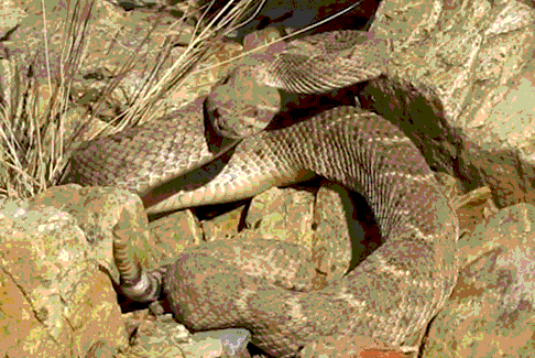
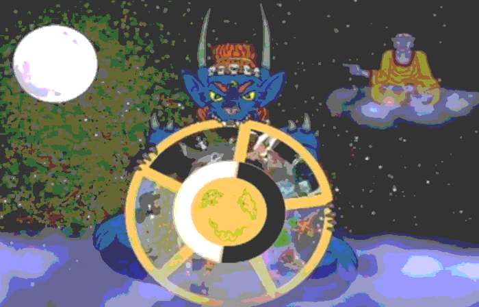
I had to edit gif to load on Tumblr. Please see original on Mark’s blog.

I was really struck by Mark’s animated gif. I kept looking at it and enjoying it, I could not explain why as snakes are not my favourite creatures. I wanted to spend more time with it to explore my response to Mark’s art more deeply.

1. What stands out the most when you first see it?

The tail of the snake almost dancing out of the picture is what stood out for me most. 

2. Explain the reason you notice the thing you mention in number 1.

I was also struck by the uniformity of colour, it is as if you are not supposed to see anything moving at all and then suddenly the tail jumps out at you. The snake blends into the rocks which is what it does in real life, the gif portrays this well with colour and cropping.

3. As you keep looking, what else seems important?

The rhythm of breathing of the snake mirrored in frame speed and I was drawn to breathing and tongue coming out, the only thing that is a different colour. 

4. Why does the thing you mention in number 3 seem important?

The black tongue says ‘danger’ and stands out of the frame in a different direction to the tail, and I can see it is a forked tongue! I imagine the artist wanted to convey the sense of danger of a snake of this type.

5. How has contrast been used?

In a way it is the lack of contrast that gives it power, it is as if it surprises the viewer as one looks at a uniform colour and what seems like just rocks on first viewing.

6. What leads your eye around from place to place?

The snake and the rocks are connected by the same colour and markings this makes the viewer look and look again. Is something moving? Is it just rocks? 

7. What tells you about the style used by this artist?

The sharpness, close framing speaks to realism. Making me almost feel the dry heat as if I was walking on a path and had actually seen it as I walk.

8.What seems to be hiding in this composition and why?

As I keep looking I notice the dry grass is moving too. I had initially thought the snake was the only thing moving and the rest had been masked as if a cinemagraph. The why may be about meaning: the grass moving helps the sense of the snake hiding in the rocks or it may be about technique, this is Mark’s second gif and masking may be something he has to play with yet.

9. Imagine the feelings and meanings this artwork represents?

‘DANGER! Keep out!’ What is interesting is that it catches a moment before anything happens and gives the viewer a sense of danger pending. We can run away…only if we are quick enough.  

10. What other titles could you give this artwork?

’Just hanging out in the sun’ ‘Now you see me, now you don’t’ ‘The west that is’

11. What other things interest you about this artwork?

I wonder about masking the grass so only snake moves, would it reduce or add to sense of danger? I also wonder about panning out so we can see more of the environment, would it detract or add to the surprise that the snake is moving in the image?

I have been making gif art for a long time now, a key thing for me is always this idea of ‘catching a moment’ – the frame selection is so precise and clean, the timing of the frames just so, this is what I see as its most powerful pull for us as viewers. Thank you, Mark.  

I have had so much fun with these!

I promised my mate Kevin (@mr45144) to create a series of (non) motivational posters with his wonderful new neighbours. He has been taking amazing photos of these creatures and I cannot but smile and relax when I see them. These images are not about drive, try hard and success. They are about lives dedicated to idleness and relaxation. It is like each images says ‘Relax! Chill! Life is good just as it is without you interfering.’ It was that sense of ease that gave me the idea of #llamainspirations ‘the motivational posters for those who want to be just lazy’. 

So I set out today to search for fonts. I found some perfect ones that cost a fortune. Not that. I kept googling got all my bits to make the posters in Photoshop. I then spent time with the photos to find the right words to go with the image. I have the psd file and the photos, I can take requests for (non)motivational quotes if you want your very own. Just leave me a comment.

My drawing class is coming to an end and I have my final project: to create a 4 frame animation of my hedgehog character from a wee ball to open and ready for anything. So starting to learn about how hedgehogs move…it was meant to be easy. Learning to draw spines first… Here is the high res animated gif of wee hedgehog unfolding.

Our radio show for DS106 ‘The DS106 Good Spell in 106 bullets’ is back this sunday! Listen at: http://ds106rad.io/listen/ 

‘The lord of death turns the wheel of life’ in Buddhist mythology. Animated gif by me for the daily create today. The lord of death reminds us that life is impermanent and cyclical – what if the new forward were around? Hence we understand the importance of wagon wheels in western movie symbolism. May be an association too far… Source 

Olderposts Newerposts

Copyright © 2024 DS106 on the couch

Theme by Anders NorenUp ↑