Category: Uncategorized

Back to Basics – Poster Design

Strictly speaking breaking a few rules this week. Don’t tell Number 2. 

Poster design would normally fall in design week. Yet, I feel a need to explore this a little more to help me with my series of posters ‘Signs of the Village’. 

I have a plan to create a kinetic typography movie by the end of the summer. I started with the idea of looking at type and signs in the work I am doing at both villages this summer: The Burgeron Family and Prisoner 106 Village

All is going well. I am learning. Yet there is so much to learn to make anything of quality. I am learning about the connection between typeface characteristics and meaning with the Lyrics Poster Assignment. This is fun and I have done e few of these. I think that in order to progress with this I need to revisit basic poster design principles. So I went to the google to get some guidance. 
image

I found a post that offered some heuristic from professional designers.  This was as good a place to start as any. I am trying to find ideas to help the design of my series improve. In what follows I am reflecting on this post and how it applies to the posters I have made so far. I also hope it may be of use to others looking for design advise. I am no designer and I understand it takes forever to grab hold of the principles, yet I also am with Ira Glass on the need for practice,

All of us who do creative work, we get into it because we have good taste. But there is this gap. For the first couple years you make stuff, it’s just not that good. It’s trying to be good, it has potential, but it’s not. But your taste, the thing that got you into the game, is still killer. And your taste is why your work disappoints you. A lot of people never get past this phase, they quit. Most people I know who do interesting, creative work went through years of this

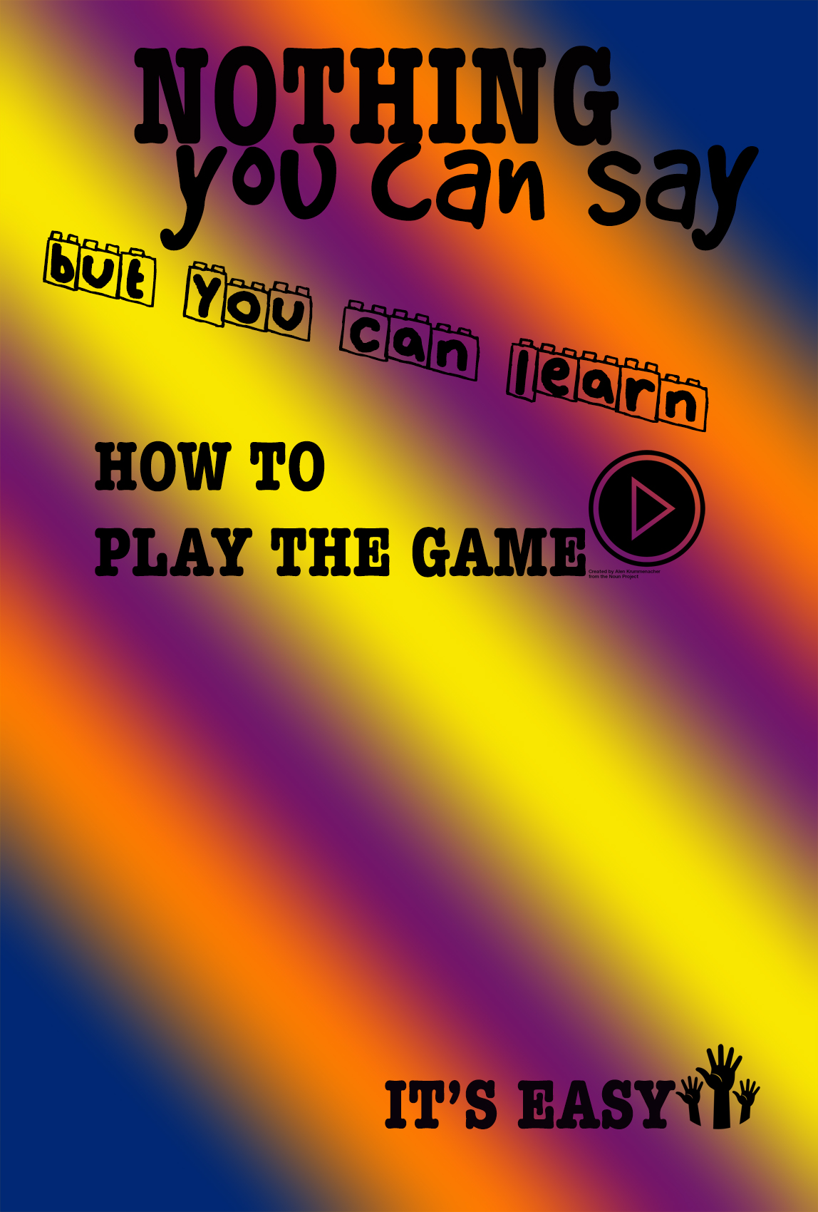
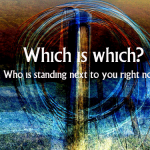
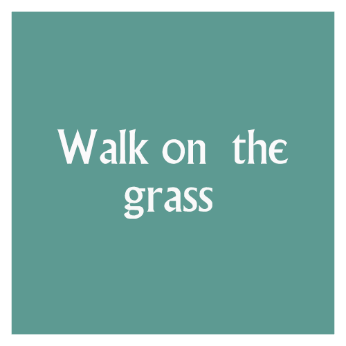
My taste is why my work disappoints me. I keep telling myself this. I like my posters so far, but they are still disappointing. Let’s see if I can improve a little over this DS106 village summer. This was the first one I made with the idea of signs. I am watching the episodes with a view to creating signs I had not noticed on first watching. 
image

Let me now look at the design heuristic in this post and see how these apply to my task. 

1. Find a focus – an overarching idea for one poster or a series of posters 

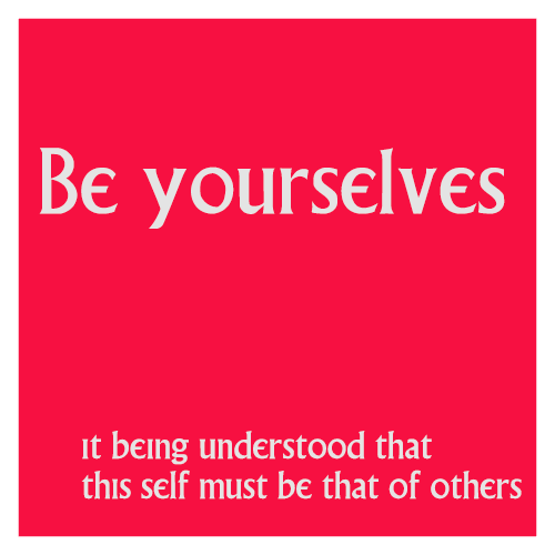
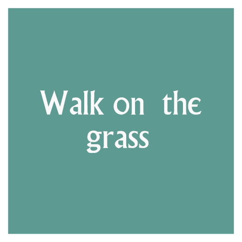
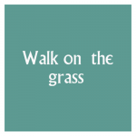
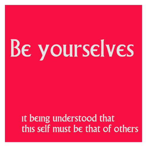
Well, I did not know I was doing that. Using the square sign template for my signs and the background of jjgifs photos for another template are my attempt at a focus. Not yet clear purpose though. Originally it was going to be existing signs in all the episodes would be square and would use basic colours washed out as in the series. John’s photos were to be for favourite quotes from the series.Yet it turns out that I am finding statements all over the place that sound like a prisoner slogan. So my sources are confused. Should I make a choice? Have 2 templates? does anyone care? I also note my frame does not show on white, does this matter?
image

2. Make an impact

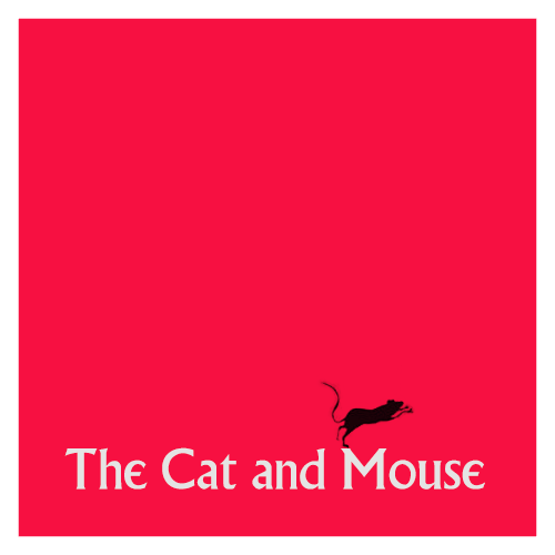
Designer on post I am exploring says ‘I like minimalist design and simple lines. I try to convey what I want with a few elements that make an impact and have a lasting message’ Yes, this is my aim too.  I made a choice to use the noun project icons to replace punctuation only. Then I broke the rule. 
image

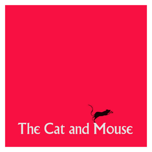
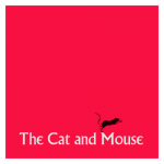
Who could resist a Blek le Rat rat for the Prisoner bar sign? I think it meets the minimalist principle, the colour should perhaps be less alive and free. Can the little rat count as punctuation?

3. Be consistent with detail

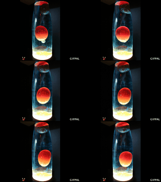
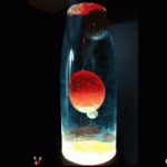
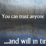
This is about consistency of typeface choices and having a rationale for background choice. I hear consistency as create a red thread for the poster or the series of posters that the viewer can perceive.  Like my choice of the unclear and surreal backgrounds by John Johnston because I felt they captured something about the essence of the series. Or keeping the colours ‘like’ those on signs in the village. My lava lamp background might fit the song of the final episode but does not belong to this series of posters. 
image

4. Choose references carefully

First step here is to actually choose references. In our case this is easy as repetition of themes is such a big part of the staging of The prisoner. 

Yet, I had not consciously seen that just choosing to focus on the signs and how to manipulate typefaces to show meaning is an example of choosing a reference. I even learnt here the difference between font and typeface – same as mp3 and song, font is the delivery mechanism of a typeface. How about that? 

5. Have fun, but stay tight on the details 

This I take to mean that you need to find a design rationale that is clear in your poster or series. The example in the post is a poster that has interchangeable human heads to show an element of a film genre where the heroes are alike across films. What unites (or differentiates) but holds true in the domain you are trying to illustrate? And if you rationale is a little obscure it helps to use accurate details from the domain so that viewer can understand. 

For me this is still fuzzy. I was planning to stay accurate and only include in the series signs and quotes actually used in the film. But I have deviated from that in making up ‘prisoner like’ quotes. May be I should delete these from this series and make a different for the non-acurate quotes?

6. Balance the composition 

Think about POV of viewer and where their eyes will go. Use a grid. Beyond that find a way to show that this poster says ‘my composition’. Can you tell a story with your poster? I guess this is like the visual version of the sound effect story. Pick elements that tell it and that the listener can recognise.

7. Balance type and image and sometimes go crazy

This is the old adage ‘know the rules before you break the rules’ and I find this idea slippery when thinking about visual poster design as there seems to be so many different rules. It seems to be about balancing opposing elements. In the example from the post, we have a poster set in one typeface but the designer allows himself freedom with the styling of that typeface. 

Yet, the usual guide seems to be that you aim for the image to be noticed first and only then the typeface with the details of the event.  In my last poster I have started to play with that – how can the style express meaning when typeface stays constant? 

image

So I tried to use position, kerning (get me using kerning and knowing what it means), italic type, capitals, inner shadows, etc. to emphasise this quote by the main protagonist. I think it is so important as to explain the set up of all the episodes. But that is another story.

8. Mix up your typography 

What? But 7 just said….yes, I know. 

Sometimes contrasting fonts can work. Graphik and SF Movie poster fonts – one bold the other condensed are used as examples in the post for contrast. I tried the many font thing, I think you need to know more about the aesthetics of fonts if you don’t want it to look like a circus. ( see poster under 3 above).

9. Spend a day with it

Take time off and then come back you will see it differently. Yes. I teach this in creativity workshops. Cognitive psychology finds that ‘sleep on it’ has value. I also learnt here that often designers will do image or font but not both. So I am setting myself as big aim here wanting to learn both. May be I need to keep background constant and just dive into typeface?

10. Your theme equals the composition 

Drawing ideas for your composition from the theme of the event/domain you are illustrating. In the post the example used is a bold capital W with many threads to show the idea of many themes within one world or discipline. Then add a frame where the lettering ‘spills over’ to show crossover of ideas. 

image

I don’t think much of the end product, but I can understand the design rationale. 

Kicker TK
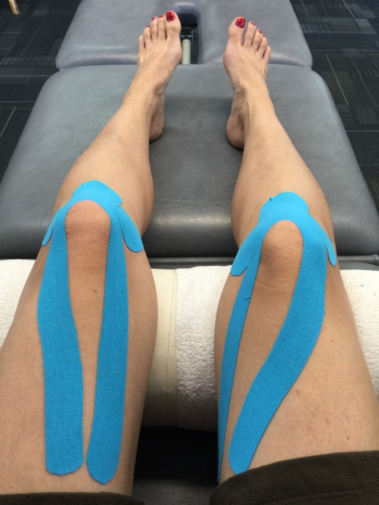
I promised Christina some ‘footage’ of her last stay at the hospital. Here she is relaxing in the therapy room with other prisoners residents. Her knees got a little tired and so we had to put some bright tape to support the knees and let them recover before she went back to her bungalow. She is much better now and her attitude towards the village as cheery as ever.

image

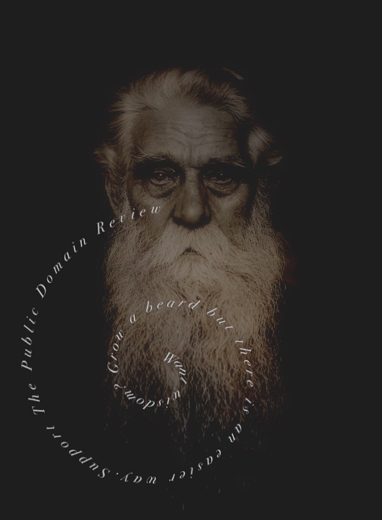
publicdomainreview need supporters!

The inspiration and the assignment. Sleep. No more information.

tumblr_nrbw9tMq5c1szp3bd

The village psychiatrist was inspired by our resident dreamer’s calming morning announcement into creating her first full track of calming music. I have titled it ‘Something mental to aid sleep’.  Here at the hospital we are always concerned with the well being of our prisoners residents and this track should be safe to listen to just as you are settling into bed after soothing day of passeggiata in the village. Enjoy.

Behind the scenes

I have been meaning to learn how to use the new Garageband for a while. So after several tutorials and muttering that the old one was better, I managed to stay with it and learn. It looks like it will even teach you how to play an instrument now. But that is for another day. 

Today I just decided to make on track. I had forgotten how much I like to edit sound. Up here, down here, left a bit right a bit….much fun.

Credits to: Ms Talky Tina with material from the archives, to 

Riccardo Colombo for a lovely background to all my craziness from Jamendo. The rest is my own bits an bobs and GarageBand’s own amazing new sound effects and loops. I had like 10 tracks mixing and blending. Rest well after you listen, if you dare. And I note that Ms Tina did actually put a coma in. Who is N1? You are, number 6. Mystery solved as Ms Tina knows the truth. 

And you know what would help us great deal? If both village committees got together and we had to practice the same type of thing each week. This week design in fairy tales and then audio with the prisoners. This shrink is pooped. 

Dear Committee,

Urgent! You need to take action immediately. It seems that my video notes about the research have been stolen. I managed to take down the video in You Tube and for now our other location is safe. Somebody infiltrated the hospital secure ward and stole my materials. 

I hope you will find it in your heart to forgive my mistake and not choose to terminate me.

image

Behind the scenes

It all started with me setting out to do the daily create. We were meant to explore boundaries in a video.  I thought about it all day and decided I wanted to focus on social boundaries. What happens when these collapse and we end up airing our dirty linen in public without intending to? I remembered about the idea of context collapse as described by Michael Wesch amongst others. 

Re-read the paper and it also explored what happens one step beyond contexts collapsing for us in our virtual lives. We imagine and prototype of ‘the public’ but this overwhelms us. So we hide  in an ‘ideal private’ that is context free as we broadcast ourselves to the world (potentially). All that is left is the echo of ego in the mind. 

Context collapse takes on a new dimension in which the
collapse of infinite possible contexts, what we might call a virtual “ideal type”
of “the public,” itself collapses with the individual’s construction of an ideal
private outside of all contexts. The scene exemplifies what Anthony Elliot and
Charles Lemert (2005) describe in The New Individualism as the “disappearance
of context” in which “we have replaced the old contexts of tradition and custom
with a focus on our individual selves” (p. 13).

Mike’s  paper is about You Tube Vlogging and how it can be used to develop self awareness. I figured I could turn this inside out by using to tell the story of Dr M who is looking to find ways to ‘get residents to give information’ in the fictional village of The Prisoner.

It was of interest to me that in the prisoner the psychological torture is always about deleting contexts. A sense of claustrophobia develops as you watch as the psyche turns inwards. In that case physical and mental. In the case our online lives, contexts collapse via social media. Is there a way that context collapse may affect our mental health? This led me to the idea of spiritual narcism.

Spiritual narcissism is the feeling or thought that 1) I´m a spiritually advanced being, enlightened, third tier etc. and 2) because of that I deserve love and respect.

In the series, N6 has only himself. Can he trust himself? Does this drive him mad? I am reminded of the idea of being an ‘un-mutual’ in one of the episodes. Compliance in that case is forced by the threat of complete isolation. As N6 walks around the village, everyone turns away. It made me wonder if this ‘idealised private context’ we create when we engage in open online activity is to some extent driven by our fear of becoming ‘un-mutual’. Feeling suitably dystopian after #prisoner106 work today. 

The daily create turned into a whole day’s exploration. Boundaries and what they mean have always interested me. Perhaps I should have kept to physical spaces….my front porch?

I cannot even start to offer information about the making of the video. Nothing worked as planned. I was going to be a ‘quick’ iMovie pull together a few fun things to take the story forward and explore boundaries. Let me just say it was not that. I ended up having to find and relearn the old iMovie. There was ScreenFlow, there was Audacity, there was Quicktime, there was Freesound.org and a stiff neck from sitting here all day making this ‘quick’ daily create. In the end, I was reminded of the simplicity and ease of the old iMovie as well as had much fun thinking about human boundaries collapsing, us becoming overwhelmed by the whole of life being accessible online and that driving us mad. <insert suitably scary loud laughter sound here>

This gif has information. No. It has INFORMATION. 

Will you click to get this information

Whose side are you on? Mine.

Well, I am now beginning to wonder about John. He does not seek escape. He gives little information and certainly not INFORMATION. Yet he responded to a cry for help from me yesterday in the G+ side of the village. 

Curiouser and curiouser!’ Cried Alice (she was so much surprised, that for the moment she quite forgot how to speak good English).

Somehow I think viewing my giant gif with the hypnotic village font led to John volunteering more information than he intended. 

I downloaded, resized to 400px wide, exported adaptive pallete 128 colours, loss 20% and got 2.9mb. Still quite a hefty gif but the one I d/led was 28 MB! (a sneaky move in wordpress is to put in a small dimension gif and stretch it a bit with css or the width parameter…

And in places he was speaking in code!

A request for information from the resident artist Kathy O led to both of us spilling yet more information. John,

It used to be tumblr liked < 500px width, < 30 frames &  < 1MB size. I think you just got to remember that a gif loads with a webpage, a movie will either wait till click or just load the first bit and play if autoplay. Too many big gifs makes your blog a sluggish boy. 

… and, having spent the evening watching the awesome giant gif (it bears watching for a long time – watch it now, or will you?) I could not help but join in.

And there is an unwritten game gif makers play! Least number of frames preserving aesthetic detail and smoothness 😉 hence play with colours and size as well as frame number. Michael has a rule of thumb for selecting frame per second depending on length. Will find.

Who is Michael? What is this rule of thumb? Will it help our prisoners residents give us more information? What made us blab? Is Kathy O on our side? Why did she resign?

John worked with my giant gif and produced a 2.9MB version that Tumblr rejected as it had been doing with all my previous versions of my giant gifs. He kept viewing it and working with it in his dream lab…

image

…and would you credit it? Here it is at just over 1MB comfy 400×257 and there is more information on his post about his secret recipes to extract information:

Any zooming was due to carelessness;-)
Downloaded your file
Reduced to 2.9MB as per notes
Used a gifsicle script to kill every second frame x 2
Back in Fireworks made frames a bit longer 30/100 sec I’d like to do that in script but can’t figure it out.

He managed to delete almost all the information on my original giant gif and cut to ‘1.1 MB I guess losing too much detail… frames cut to 29.” What did he mean? Losing too much detail? I thought that was precisely the point. Lose detail so they do not get the full information. 

I felt that it was right to make this into a Gif-Collab with jjgifs. I suggested this straight after expressing my amazement at the amount of information he had gotten out of my original gif. I did not think this through. 

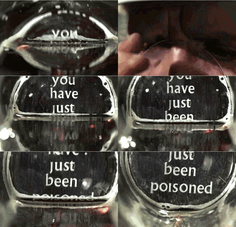
Happy to share your credits, we can have a non-alcholic whisky in the Village bar! Sounds like poison:-)

We can share credit units alright, after all we have both been working hard enough to keep our lights on at the village. But the rest of the message? He speaks as if he does not know about ‘the cave’ with real whisky? The village bar? Sounds like poison? Does he mean to poison me? Is he worried I might poison him? Has he been to ‘The Cat and Mouse’?

image

And then resident Ron joined us. He seemed relaxed and cheery enough. He had overheard our conversation. 

He suggested he would join us at The Cat and Mouse game Bar. Or did he meant ‘the cave’ with real alcohol? We all know what happens there and what that alcohol really does to you, don’t we?

I’ll toast virtually on your collaborative success!

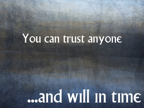
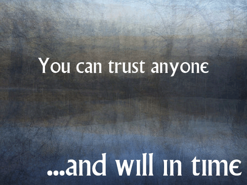
Hmmmm….virtually? May be he is not real, Ron I mean. You can’t trust anyone’s information here. Or can you? Then  the village librarian, Mel, also viewed the giant gif and…

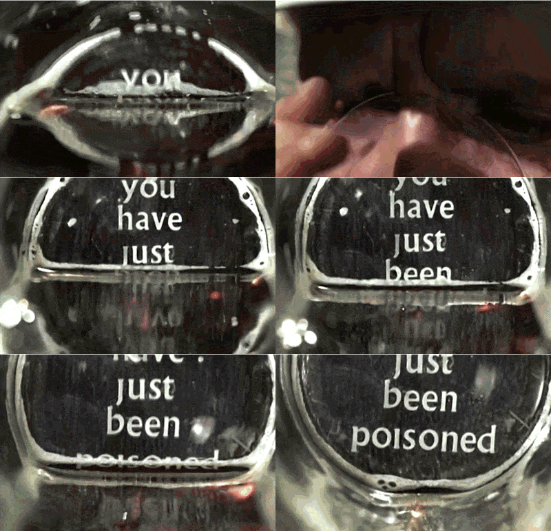
@mdvfunes That is awesome. And now I want to etch ALL the pint glasses!

All the pint glasses? Where? Why? Does she have information we need? Does Mel know we can buy those glasses and use them at the bar when we visit? Question is will we just use the glasses or will the glasses be a warning for something more sinister?

I then go to John’s blog and he has clearly been affected by the hypnotic village font signs. He has given out more information. He keeps repeating the same information. Have they got to him? Here is an excerpt.

  1. Open video in MPEGStreamclip
  2. Select in and out points
  3. Trim (command T on a mac)
  4. Export to Other Formats…
  5. Choose Image Sequence
  6. I usually click options and choose Jpeg and 12 frames /second
  7. Export
  8. Right Click on First File in export list
  9. Open in Fireworks
  10. Select all the other images in series & Drag to FW window
  11. Cmd-A Select All
  12. Open FW Frames window, Choose Distribute To Frames from the Window
  13. This creates a series of frames.
  14. Further editing and setting the Export Options in the Optimise Window
  15. Export to Gif

Once again some of it is in code and it requires Fireworks. Only the Committee has access to Fireworks. Too much information. 

Dear Village Committee,

I keeping with my assignment at your village this summer. I have started investigating the signage around the village and recreating them in square format. There is a significant amount of research to indicate that square signs correlate positively with increased conformity. 

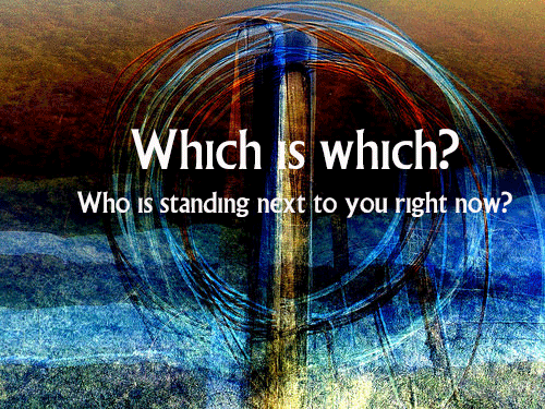
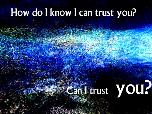
I am consulting with our resident Dreamer by numbers, jjgifs, and he has offered the hypnotic blue backgrounds to this week’s quotes from the 3 dossiers you gave me to study in the Archives for this week. His research shows that this background colour and complex shapes supports this committee’s aim to keep all residents wondering ‘whose side are you on?’ in order to instigate uncertainty and enable our residents to give the committee the information they need. It appears these subliminal background messages work over time to increase compliance and extraversion. It is early days in this DS106 special assignment at the village and we hope that this work will evolve into kinetic typography with sound to enable even faster acquisition of information from residents. We are researching this process thoroughly and hope to offer a sophisticated technical innovation that will allow all residents to create their own compliance devices. Here is a prototype for your approval. 

I hope that this week’s work meets with your approval and added to my viewing of the 17 dossiers that tell the full story of this village and it prisoners residents last week will suffice to be paid the Credit Units I need to continue my very important work at the hospital this summer s your resident psychiatrist.

Be seeing you.

Copyright © 2026 DS106 on the couch

Theme by Anders NorenUp ↑