Strictly speaking breaking a few rules this week. Don’t tell Number 2.
Poster design would normally fall in design week. Yet, I feel a need to explore this a little more to help me with my series of posters ‘Signs of the Village’.
I have a plan to create a kinetic typography movie by the end of the summer. I started with the idea of looking at type and signs in the work I am doing at both villages this summer: The Burgeron Family and Prisoner 106 Village.
All is going well. I am learning. Yet there is so much to learn to make anything of quality. I am learning about the connection between typeface characteristics and meaning with the Lyrics Poster Assignment. This is fun and I have done e few of these. I think that in order to progress with this I need to revisit basic poster design principles. So I went to the google to get some guidance.
I found a post that offered some heuristic from professional designers. This was as good a place to start as any. I am trying to find ideas to help the design of my series improve. In what follows I am reflecting on this post and how it applies to the posters I have made so far. I also hope it may be of use to others looking for design advise. I am no designer and I understand it takes forever to grab hold of the principles, yet I also am with Ira Glass on the need for practice,
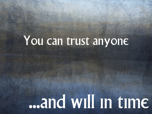
All of us who do creative work, we get into it because we have good taste. But there is this gap. For the first couple years you make stuff, it’s just not that good. It’s trying to be good, it has potential, but it’s not. But your taste, the thing that got you into the game, is still killer. And your taste is why your work disappoints you. A lot of people never get past this phase, they quit. Most people I know who do interesting, creative work went through years of this
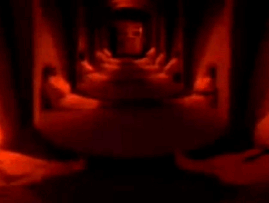
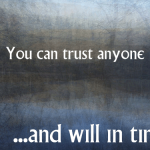
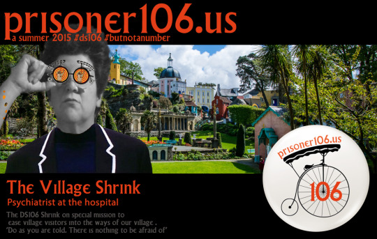
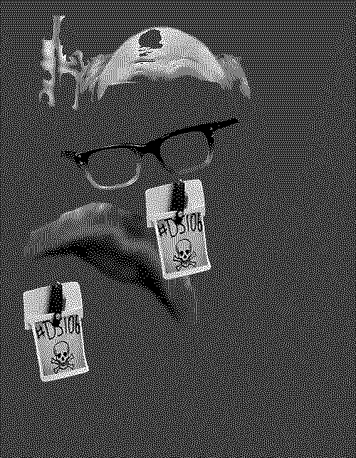
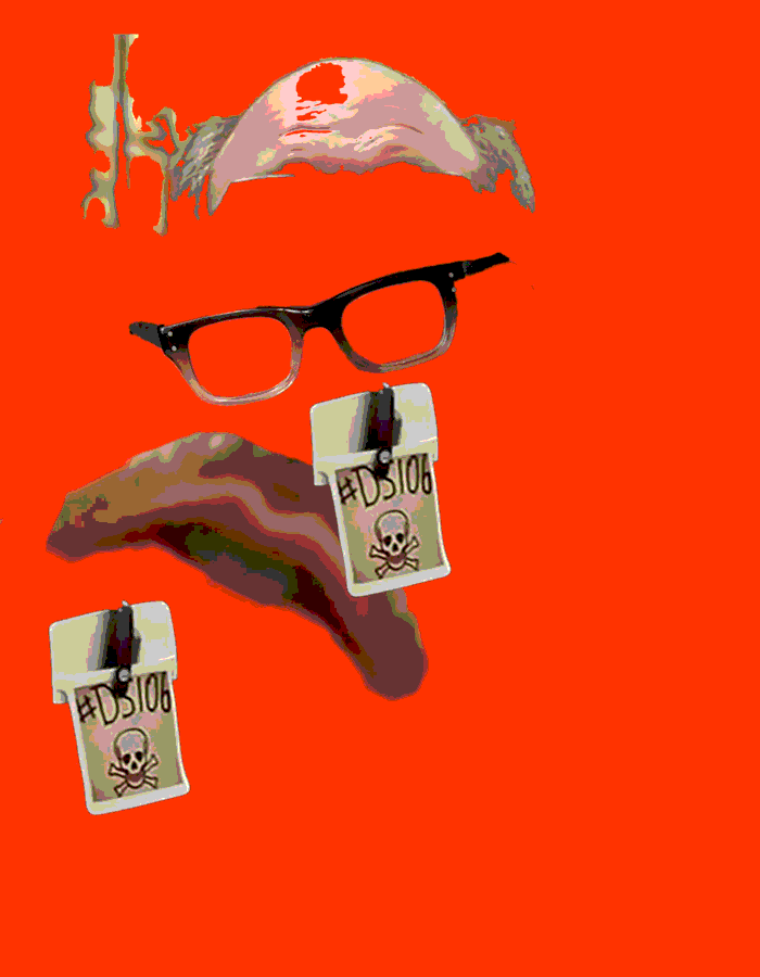
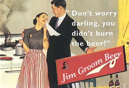
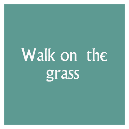
My taste is why my work disappoints me. I keep telling myself this. I like my posters so far, but they are still disappointing. Let’s see if I can improve a little over this DS106 village summer. This was the first one I made with the idea of signs. I am watching the episodes with a view to creating signs I had not noticed on first watching.
Let me now look at the design heuristic in this post and see how these apply to my task.
1. Find a focus – an overarching idea for one poster or a series of posters
Well, I did not know I was doing that. Using the square sign template for my signs and the background of jjgifs photos for another template are my attempt at a focus. Not yet clear purpose though. Originally it was going to be existing signs in all the episodes would be square and would use basic colours washed out as in the series. John’s photos were to be for favourite quotes from the series.Yet it turns out that I am finding statements all over the place that sound like a prisoner slogan. So my sources are confused. Should I make a choice? Have 2 templates? does anyone care? I also note my frame does not show on white, does this matter?
2. Make an impact
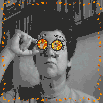
Designer on post I am exploring says ‘I like minimalist design and simple lines. I try to convey what I want with a few elements that make an impact and have a lasting message’ Yes, this is my aim too. I made a choice to use the noun project icons to replace punctuation only. Then I broke the rule.
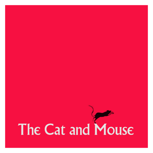
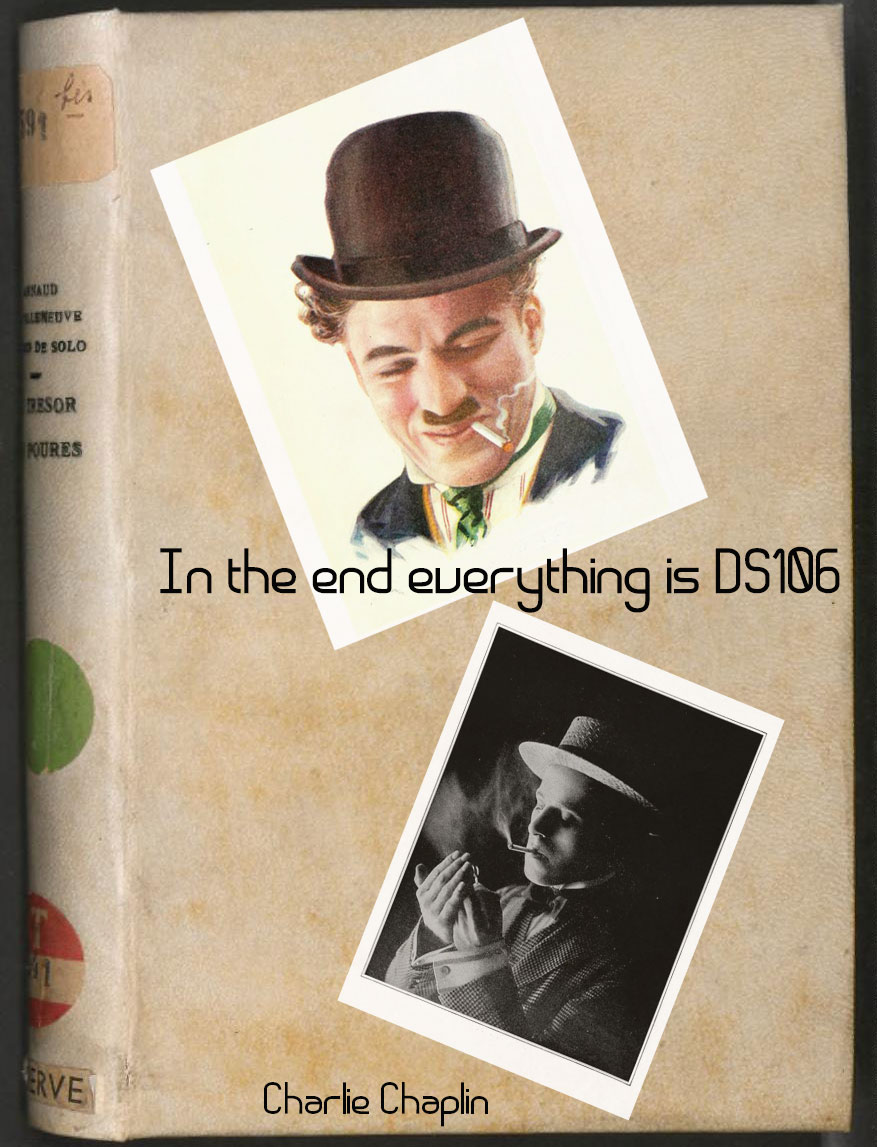
Who could resist a Blek le Rat rat for the Prisoner bar sign? I think it meets the minimalist principle, the colour should perhaps be less alive and free. Can the little rat count as punctuation?
3. Be consistent with detail
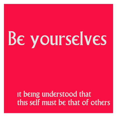
This is about consistency of typeface choices and having a rationale for background choice. I hear consistency as create a red thread for the poster or the series of posters that the viewer can perceive. Like my choice of the unclear and surreal backgrounds by John Johnston because I felt they captured something about the essence of the series. Or keeping the colours ‘like’ those on signs in the village. My lava lamp background might fit the song of the final episode but does not belong to this series of posters.
4. Choose references carefully
First step here is to actually choose references. In our case this is easy as repetition of themes is such a big part of the staging of The prisoner.
Yet, I had not consciously seen that just choosing to focus on the signs and how to manipulate typefaces to show meaning is an example of choosing a reference. I even learnt here the difference between font and typeface – same as mp3 and song, font is the delivery mechanism of a typeface. How about that?
5. Have fun, but stay tight on the details
This I take to mean that you need to find a design rationale that is clear in your poster or series. The example in the post is a poster that has interchangeable human heads to show an element of a film genre where the heroes are alike across films. What unites (or differentiates) but holds true in the domain you are trying to illustrate? And if you rationale is a little obscure it helps to use accurate details from the domain so that viewer can understand.
For me this is still fuzzy. I was planning to stay accurate and only include in the series signs and quotes actually used in the film. But I have deviated from that in making up ‘prisoner like’ quotes. May be I should delete these from this series and make a different for the non-acurate quotes?
6. Balance the composition
Think about POV of viewer and where their eyes will go. Use a grid. Beyond that find a way to show that this poster says ‘my composition’. Can you tell a story with your poster? I guess this is like the visual version of the sound effect story. Pick elements that tell it and that the listener can recognise.
7. Balance type and image and sometimes go crazy
This is the old adage ‘know the rules before you break the rules’ and I find this idea slippery when thinking about visual poster design as there seems to be so many different rules. It seems to be about balancing opposing elements. In the example from the post, we have a poster set in one typeface but the designer allows himself freedom with the styling of that typeface.
Yet, the usual guide seems to be that you aim for the image to be noticed first and only then the typeface with the details of the event. In my last poster I have started to play with that – how can the style express meaning when typeface stays constant?

So I tried to use position, kerning (get me using kerning and knowing what it means), italic type, capitals, inner shadows, etc. to emphasise this quote by the main protagonist. I think it is so important as to explain the set up of all the episodes. But that is another story.
8. Mix up your typography
What? But 7 just said….yes, I know.
Sometimes contrasting fonts can work. Graphik and SF Movie poster fonts – one bold the other condensed are used as examples in the post for contrast. I tried the many font thing, I think you need to know more about the aesthetics of fonts if you don’t want it to look like a circus. ( see poster under 3 above).
9. Spend a day with it
Take time off and then come back you will see it differently. Yes. I teach this in creativity workshops. Cognitive psychology finds that ‘sleep on it’ has value. I also learnt here that often designers will do image or font but not both. So I am setting myself as big aim here wanting to learn both. May be I need to keep background constant and just dive into typeface?
10. Your theme equals the composition
Drawing ideas for your composition from the theme of the event/domain you are illustrating. In the post the example used is a bold capital W with many threads to show the idea of many themes within one world or discipline. Then add a frame where the lettering ‘spills over’ to show crossover of ideas.

I don’t think much of the end product, but I can understand the design rationale.
Kicker TK