DS106 on the couch

Tag: reflections (page 1 of 5)

Letting Go

image

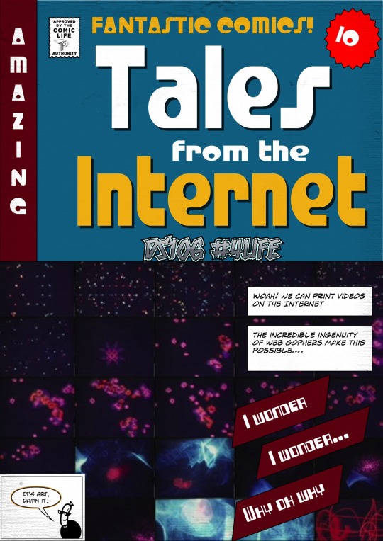
So we came to the end of our radio show  The DS106 Good Spell in 106 Bullets. We did it in 107 bullets, of course!

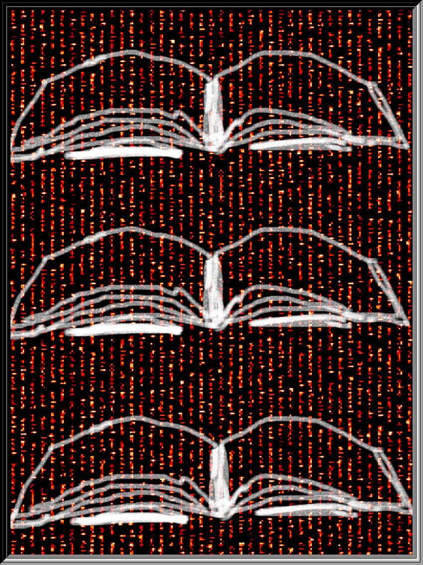
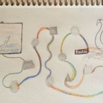
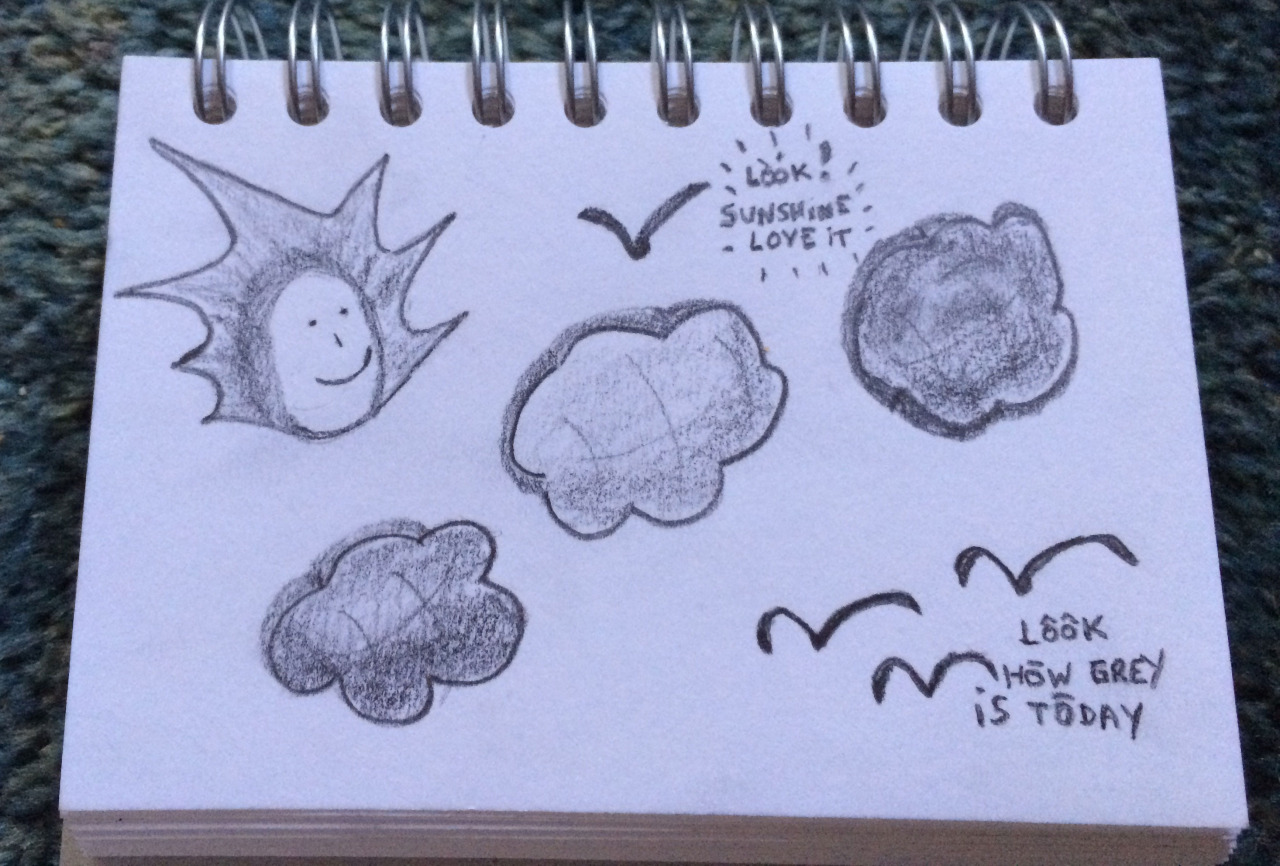
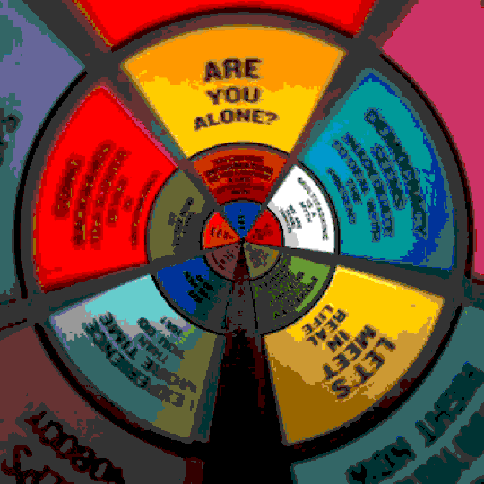
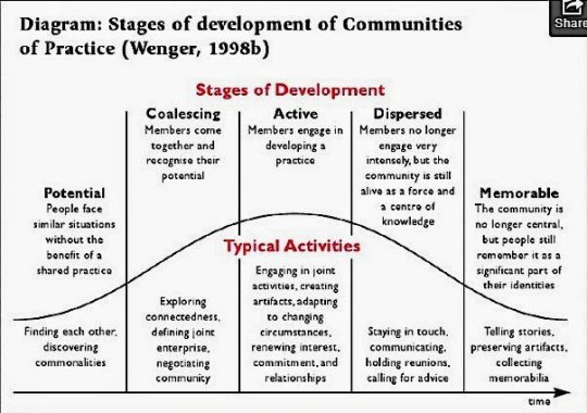
Just before the last episode somebody sent me the above diagram, it reminded me that cycles are an inherent part of life. It also got me reflecting on the nature of the ‘group’ that is DS106 as an online open community. In our last show we talked about the value of combining of open participants and those doing the course at a university for a qualification. We spoke about how this reciprocal relationship works – offering students at a university a sense of audience beyond the professor and open participants a sense of structure and physicality that supports learning. 

The rest of this post is my personal reflections after the final show. 

Looking at the diagram I see how little ‘we’ within the DS106 community we talk ‘about’ the nature of the group we are; attention seems always focussed in the digital output we produce and we relate through that over time. Using the ideas  in the diagram as a descriptive and reflective model, I very much see  the hashtag classroom that is #ds106  as a community of practice. 

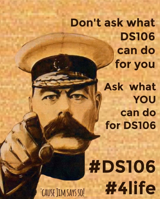
I remember starting to learn about it and seeing its potential for supporting learning; taking the first steps to get to know people and evaluating if this were ‘my kind of people’. Once I joined the question changed to how I could contribute. What Jim Groom referred to on our show as ‘we ask what we can do for #ds106 rather than what it can do for us’. This desire to contribute does not come from nowhere; it comes and grows as we see how being part of this group helps our digital practice. Some of us see what we do as art, others as story, yet others as mere artefact (that would be me when I started); but what brings us together is the practice we share and are developing. For some of us it is a limited enterprise, we need the credits for the course and for others of us it is a wider enterprise that supports the work we do elsewhere on an ongoing basis.

@ronald2008

The DS106 Good Spell show is a good example of the last two stages in the diagram. The ‘course’ I did, DS106 Headless, finished in 2013. Some people dispersed and some of us stayed in touch and continued to engage around the hashtag as  ‘a force and a centre of knowledge’ that still exists and that is to some extent independent of who participates at any one time.

John and I started this little project as a way to stay connected *because* we experienced the value of the community. We kept making stuff. We stayed around to be of use to others as best we could whilst we moved on to other projects and life. Even when DS106  is ‘no longer central’ (in the sense that it takes up every waking hour of your life) ‘people still remember it as an integral part of their identities’. Online, we express this with the hashtag #4life and make jokes about how DS106 is like Hotel California – you can check-out any time you like, but you can never leave.

image

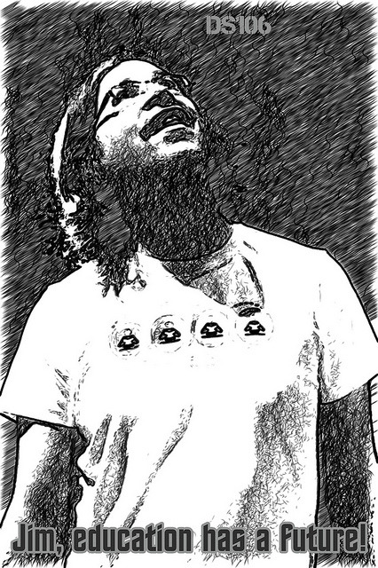
The last episode of the DS106 Good Spell Radio Show was very much and example of this ‘memorable’ stage the diagram suggests as the end of the cycle. We told many stories, spoke about artefacts we have made and created. And, of course, the show itself is the most amazing artefact. @johnjohnston has painstakingly archived it all, so anyone can binge listen all episodes!

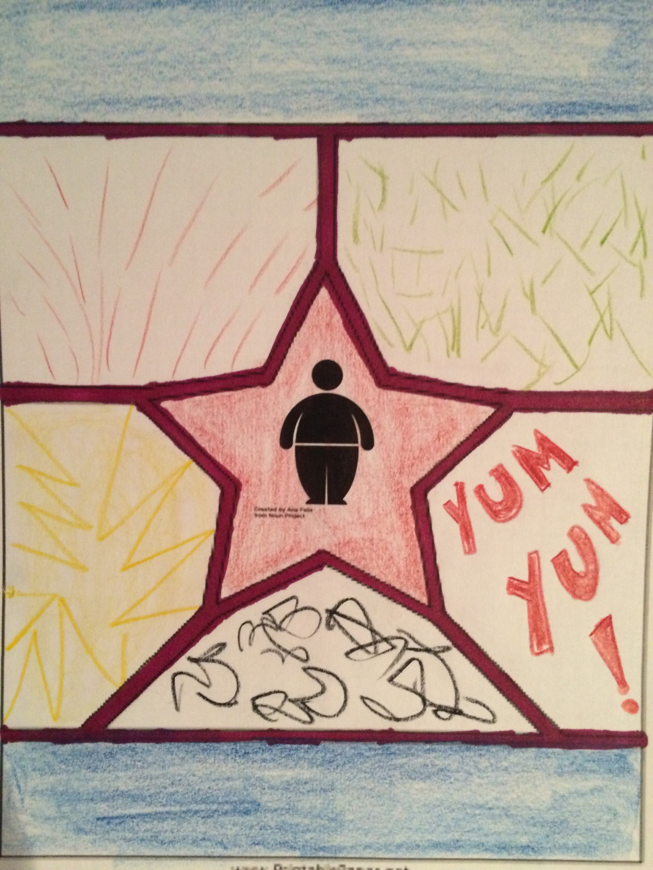
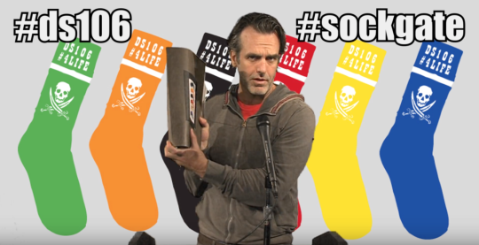
As we spoke about what we made, the stories we tell through time and the way in which ‘DS106 is just like the Internet but with less trolls’ you can hear in our voices how proud of DS106 memorabilia we are and how much we all wish we had some DS106 socks! (in-joke, sorry. But if you are interested watch the latest instalment of the story here). We talked about the most significant symbol of all, the number 106. A meaningless symbol given life by the relationships and stories people chose and choose to build around it. We even made a radio programme on DS106 Numerology, of course.

image

source

We spoke about issues of inclusion and exclusion. There is a way in which DS106 does not set up to be inclusive. This for me connects with how our attention is on what we make and how we embody what we believe: ‘Show them, don’t tell them’ is a mantra for DS106. To me, this simple sentence expresses the essence of transformational pedagogy much more than much of the convoluted jargon I read on open pedagogy (critical or otherwise) elsewhere. 

The ethos of DS106 means that it is not for everyone, there is a vulnerability that comes with being willing to ‘futz splendidly’ in public. On the show we spoke about how what was important to us as educators was to be as transparent as possible about the nature of the experience, make it okay for people to join or not – much in the same way as not everyone plays golf and joining a golf club is not something inherently good or bad, just a preference. 

We may be more dispersed now than when I started in 2013, may be we only gather around the metaphorical campfire to reminisce about the great old days sporadically as other projects gain our attention. Yet, the important things remain and develop outside of the hashtag.

John and I are talking about a new radio show, I am furnishing a new home outside of Tumblr where I will show my ‘digital art’. I can now contemplate the idea of calling myself an artist as well as an academic. My new online home is with the best educational hosting company ever, Reclaim Hosting , run by DS106 folk.  I started to build an online contemplation studio, again with Reclaim Hosting, at the stillweb.org with support from people I met through DS106. I even run a kind of daily create of my own, thanks to @cogdog​, focussed on activities to ‘find stillness in movement (digital or otherwise)’ which I use in my university teaching on the LMS. All this and more would never have been possible without the people I have met through this great hashtag. 

The joy of having been part of what Warren Bennis labels ‘a great group’ will stay with me for a lifetime and reminds me that open true ego-free collaboration is possible…even at times when competition and comprehensive doctrines seem to make up most of our educational dialogue online. As James Poulos explains,

We’re all succumbing to what philosophers call “comprehensive doctrines.” Translated into plain language, comprehensive doctrines are grandiose, all-inclusive accounts of how the world is and should be.

Whatever I do for #ds106 going forward will never pay the debt I feel for it offering  me a learning environment that reminds me each day what true education can be.

image

The new daily create site is making me lazy. It is so easy to just post on Twitter and forget to write posts narrating process and reflecting on learning. I keep telling myself it is ephemera and it does not matter, picking up on Michael Branson Smith’s  distinction between ephemeral art and more long term projects. 

All this is true. What is also true is that each little creation teaches me something and helps me keep up to date with what the web offers to help us make digital art. 

The rest of this post is my attempt to put this right in terms of a few dailies Creates I made the last few weeks. I want to explore the tools I used and write some reflections on what I have learnt.

A while back we made a logo with a logo generator. My immediate reaction to it was negative. I often find that with prompts that send me in directions I would not choose to go! What is the point of just using a programmer’s knowledge of design in order to create an output that I have nothing to do with? Where is the creativity in that? I have learnt to ignore the critic when it comes to this type of thing. So I started to play with Emblematic

My immediate reaction was: meh. But here is the kicker; as I played I saw that it was possible to adapt parameters in the designs I liked. Some of these parameters were not familiar to me and changing them taught me new elements of design. In making a choice about what I like, I am choosing what I like for a purpose. This taught me something about aesthetics for fulfilling a brief. It is not the same to design a logo for this blog and for, say, a fake hipster new ‘hood as in my ‘WickGre’  logo above. Again, quoting Michael and @ryanseslow: In making a choice about ‘like’ I am learning something about art even if I am not creating it myself; I am learning about refining my taste for a purpose. A design skill. 

I first used Emblematic to make the new logo for this blog. When it came to creating acronames I remembered that tool and decided to use it. The brief: a hipster fake name for an area in my locality. I do not want to put too much location information online, because I am paranoid. So, I chose a local area that has gone through huge development recently but is not too close to me. The development has been controversial. I remembered the idea of Honest Slogans (another daily create from a long time ago, I think). What would it be like if my fake name for the new development had an honest slogan? 

So I looked for an image that would be an accurate reflection of what people are buying when they buy houses there. The place basically overlooks a huge roundabout with a huge superstore. I have nothing against this, but it does feel rather dishonest when commercials advertise the new homes as ‘luxury countryside living’. It is dangerous to cross the roads to get out of the development and I fail to see how living by a roundabout (large road intersection, for those not in the UK) can be said to be ‘countryside’. So, I made my poster for WickGre – creating places where people aspire to live, with a background of the large roundabout that defines it. It really is not that different from “DoWiSeTrePla”  – Downwind of the Sewage Treatment Plant mentioned on the podcast that explores ‘the SoHo effect’. Perhaps I should have called it: CleViBiRo – Clear View of Big Roundabout. 

On other news, we had a another create that made us use a nifty tool that allows us to print out video. Again, I could not see the point initially. I knew that @johnjohnston had made these storyboards many times and his were awesome. What was the point of something that gave you no control? You just gave it a URL and then it gave you a series of frames on a pdf. Meh. But, not meh! Read on.

John’s scrolls are wonderful but beyond those of us who do not command the Command line on a Mac. This tool made this accessible to the rest of us, but I genuinely did not see this when I first tried the tool. So I made a comic.

image

I could see how awesome the programming was, I could not see practical applications. I chose to do my background with and abstract video. I got a beautiful wallpaper, and assumed that this would be the only use. Then others started to use it. I realised how wrong I was. Jim Groom explored the potential use for scene analysis and understanding of a film. Doh! Of course, I never thought of that. I left a comment to that effect. He further suggested in his response,

Yeah, John Johnston has been doing amazing experiments along these lines for a few years now, we need to make some of that available. I like the idea of a daily tool..

Yes! Imagine watching a film and being able to create a storyboard of different scenes to analyse later not being dependent on You Tube. I started to learn how this could be useful practically as well as aesthetically. 

We then had a daily create that asked us to give clues for people to guess a movie. I immediately thought about the print a video tool. Get a scene and use as background to give clues on top of that background. The film was easy to guess, but I thought the poster looked lovely with the watercolour version of Blade Runner as background. 

image

And we are up to yesterday’s daily create. A 3 word map story. For this to work with the image of a map, I had to post location information. How to do it without that? I searched for my 3 words for the same location of my previous honest poster: Bricks, Flames and Active. This made me laugh. I immediately thought of the slogan: Actively flaming the countryside one brick at a time. I did a little bit of research. Turns out that 1500 houses have been built, without any changes to the local infrastructure. Who knows what the people buying the houses will have to go through as the houses sell – no more school places, no more parking, no more access roads…

I decided to do a protest poster. I wanted to do flames around the logo. I have tried and failed to learn how to do this in Photoshop before; mainly because I did not get the how to select a path before rendering the flames. I used a tutorial and managed to create what I had in mind. 

image

I replaced the background with a wallpaper of some public domain footage of a black and white house build, using the print video tool. And Bob is your uncle. 

So, yes it is true that the creations are ephemeral and are not something I will add to my best work folder. Yet, as a daily practice it cannot get much better than this: my expectations challenged so I can learn something new, finding practical uses for tools I was unfamiliar with, learning one more trick in a tool that will take many lifetimes to learn well and finding out about my local area’s development plans. 

And the biggest gift? I realise that I now have a tool to select frames for gifs easily. I can print it out, take time to view as stills and select my moments when making video gifs. Anything that help us gif better is a god send, says @gifadog 

Thank you, daily create.

These are the last 9 days using the #gridsgestures activity to reflect on the day.

I have spoken before about how it is helping me learn about comics.  

These last 9 days have done that too but I have focussed much more on the reflective quality of the activity. Making the commitment to do one daily, has me thinking about the essence of my day through the day. That is a nice thing. What is the most relevant thing that I will want to put into this abstract comic format at the end of a day? I think about the flow of my day, key things that happened and how then to describe in a page with no words, not drawings just panels and marks…yes, I cheat a little but it is nice to learn about ‘written sound’ in comic, or asemic writing to make it seem like words but not words….I have also experimented with different media this time and have gone back to pencil! I like pencil. 

Thank you @nsousanis for a great learning space. 

Why U use Tumblr?

image

Aaron Davis (@mrkrndvs on Twitter) is presenting somewhere on blogging platforms. He asked about Tumblr on Twitter and I tweeted a few things. 

It is such a good question though, I often ask myself why use it. So, I thought I would reflect out loud here and it may be of use for Aaron’s presentation. It also serves as the ideal displacement activity for avoiding grading papers. 

First thing: Always use the ‘keep reading tag’. People forget that the Dashboard on Tumblr is designed for media other than words and long text posts are utterly annoying on the Dashboard. 

I use many different platforms, I try all I can and have the capacity to because I am often asked to advice people on developing their digital presence – often academics or therapists. I always recommend WordPress. 

So why U use Tumblr? 

One big reason is their archive link. I have not found any other platform that allows me to view my work in such an aesthetically pleasing manner without me having to do anything except type in a URL. Try it now for this blog. Awesome, no?

If Tumblr disappeared tomorrow, I would be heartbroken to lose my archive. 

Staying on the use side of it, once upon a time I also loved the editor and its simplicity. It was easy to learn HTML as you could access it easily and customise Tumblr themes with no hassle. If you did not know something the Tumblr community always had a post or a response to help out with a quick search. They have now gone ‘all medium’ on us. I think the editor is not nearly as good as it once was. And the HTML option for viewing your posts is not very user friendly anymore – I guess the majority of users just post media other than text so the editor caters more for that now. 

Because it is designed for showing photos, animated gifs and video – what you can do with that here is better than on any other platform. Check out the photo gallery options. It is easy to make things look good on Tumblr. 

Then, there is the Dashboard. If you curate your follows well, there is nothing I like more than settling of an evening to view the Tumblr Dashboard. For me it is like an art exhibition in my lounge. Its main use case is for those interested in digital art, I would say. Young ones use it for confessional blogs too. If you go to certain spaces you are likely to be surprised and/or shocked but what can be found here. Yet, to me that is one of the attractions; it is unpredictable and it challenges me more than other platform – no cozy echo chamber of like minded folk.

And yet, there is also a great sense of community here. I have never had a problem with my theme that I have not been able to solve, there are so many themes to choose from and these are so easily customisable that one can be creative in ways that other platforms do not allow. Or rather, other platforms do not allow with as much ease. There is no assumption of technical know how in Tumblr land – people want an output and find a way to do it with the help of others who try things out. 

I do not reblog stuff, but many people do. I like the idea that in doing this, young people can discover their own sense of aesthetics as @ryanseslow often says. I can see that there are many other platforms that offer more technically, my attachment to Tumblr is more emotional than technical. It is a friendly space and it makes it easy for me to do stuff. 

Who is it good for? I would say that artists and people who are interested in art. It is also good for people who want to learn about digital trends – Tumblr attracts people who like to play and experiment with the digital, sometimes in ways that I find quite unexpected. But to find all of this you need to invest time searching and curating your sources carefully. 

Would I use it if I was starting now? No. I think that with the adverts and suggestions of who to follow on the Dashboard my ‘art gallery’ experience is diminished. I would pay for no adverts or suggestions, but this is not the way of the world. 

Also, I love gifs and I love the constraints that Tumblr puts on size of what can be uploaded. It helps me hone my technical skills. The tension between the aesthetics of a gif and the number of frames or colours used is one of the joys in making gifs for me. I learnt about all of that thanks to Tumblr – I wanted to post gifs on my blog and I had to learn how to make it work. This is the essence of what makes me like it: it pushes me to experiment with stuff to get an output.

Some more downsides: there are many many ways to view stuff (the archive, the dashboard, your blog, your post, etc.) You need to learn how it all works or there will be a view that will look bad if you do not update it. It takes time to get how the community side of things works if this is something that attracts you. If there is a topic that interests you or that you want to be known for – be sure to study the hashtags used. A lot of what works on Tumblr is about the tags. 

It is quirky, it is easy, it is experimental, it is the only place on the web where I feel free to futz. But that may be just me. 

An interesting Daily Create today.

It talks about an old song that I knew as by Joni Mitchell though it turns out  somebody called Judy Collins sang it first. Who knew?  

As I listened to the song ( the Joni Mitchell version, of course) I doodled a cartoon in my sketchbook by hand. The simple idea being that you get to see both sides of the cloud if you change location (or attitude). Yet, if you take the point of view of the viewer you see that ‘truth’ lies in both sides rather than one or the other. Kind of like what the song is saying. 

I then wanted to ‘improve’ on the idea and simple sketch. I went to Strip Generator and created a comic strip there. Same idea, still simple but tidier, more words and 3 frames. I was able to use a line from the song at the end frame which may be seen as more amusing.

Just reflecting on where the creativity lies. The idea? The execution? The quality of the output? I had great fun with my wee sketch, yet it is so basic and simple compared to the digital comic strip. All I had to do to produce it was copy image templates already available and type in some text in boxes already provided by the generator. 

I really don’t know clouds at all. 

Back to Basics – Poster Design

Strictly speaking breaking a few rules this week. Don’t tell Number 2. 

Poster design would normally fall in design week. Yet, I feel a need to explore this a little more to help me with my series of posters ‘Signs of the Village’. 

I have a plan to create a kinetic typography movie by the end of the summer. I started with the idea of looking at type and signs in the work I am doing at both villages this summer: The Burgeron Family and Prisoner 106 Village

All is going well. I am learning. Yet there is so much to learn to make anything of quality. I am learning about the connection between typeface characteristics and meaning with the Lyrics Poster Assignment. This is fun and I have done e few of these. I think that in order to progress with this I need to revisit basic poster design principles. So I went to the google to get some guidance. 

image

I found a post that offered some heuristic from professional designers.  This was as good a place to start as any. I am trying to find ideas to help the design of my series improve. In what follows I am reflecting on this post and how it applies to the posters I have made so far. I also hope it may be of use to others looking for design advise. I am no designer and I understand it takes forever to grab hold of the principles, yet I also am with Ira Glass on the need for practice,

All of us who do creative work, we get into it because we have good taste. But there is this gap. For the first couple years you make stuff, it’s just not that good. It’s trying to be good, it has potential, but it’s not. But your taste, the thing that got you into the game, is still killer. And your taste is why your work disappoints you. A lot of people never get past this phase, they quit. Most people I know who do interesting, creative work went through years of this

My taste is why my work disappoints me. I keep telling myself this. I like my posters so far, but they are still disappointing. Let’s see if I can improve a little over this DS106 village summer. This was the first one I made with the idea of signs. I am watching the episodes with a view to creating signs I had not noticed on first watching. 

image

Let me now look at the design heuristic in this post and see how these apply to my task. 

1. Find a focus – an overarching idea for one poster or a series of posters 

Well, I did not know I was doing that. Using the square sign template for my signs and the background of jjgifs photos for another template are my attempt at a focus. Not yet clear purpose though. Originally it was going to be existing signs in all the episodes would be square and would use basic colours washed out as in the series. John’s photos were to be for favourite quotes from the series.Yet it turns out that I am finding statements all over the place that sound like a prisoner slogan. So my sources are confused. Should I make a choice? Have 2 templates? does anyone care? I also note my frame does not show on white, does this matter?

image

2. Make an impact

Designer on post I am exploring says ‘I like minimalist design and simple lines. I try to convey what I want with a few elements that make an impact and have a lasting message’ Yes, this is my aim too.  I made a choice to use the noun project icons to replace punctuation only. Then I broke the rule. 

image

Who could resist a Blek le Rat rat for the Prisoner bar sign? I think it meets the minimalist principle, the colour should perhaps be less alive and free. Can the little rat count as punctuation?

3. Be consistent with detail

This is about consistency of typeface choices and having a rationale for background choice. I hear consistency as create a red thread for the poster or the series of posters that the viewer can perceive.  Like my choice of the unclear and surreal backgrounds by John Johnston because I felt they captured something about the essence of the series. Or keeping the colours ‘like’ those on signs in the village. My lava lamp background might fit the song of the final episode but does not belong to this series of posters. 

image

4. Choose references carefully

First step here is to actually choose references. In our case this is easy as repetition of themes is such a big part of the staging of The prisoner. 

Yet, I had not consciously seen that just choosing to focus on the signs and how to manipulate typefaces to show meaning is an example of choosing a reference. I even learnt here the difference between font and typeface – same as mp3 and song, font is the delivery mechanism of a typeface. How about that? 

5. Have fun, but stay tight on the details 

This I take to mean that you need to find a design rationale that is clear in your poster or series. The example in the post is a poster that has interchangeable human heads to show an element of a film genre where the heroes are alike across films. What unites (or differentiates) but holds true in the domain you are trying to illustrate? And if you rationale is a little obscure it helps to use accurate details from the domain so that viewer can understand. 

For me this is still fuzzy. I was planning to stay accurate and only include in the series signs and quotes actually used in the film. But I have deviated from that in making up ‘prisoner like’ quotes. May be I should delete these from this series and make a different for the non-acurate quotes?

6. Balance the composition 

Think about POV of viewer and where their eyes will go. Use a grid. Beyond that find a way to show that this poster says ‘my composition’. Can you tell a story with your poster? I guess this is like the visual version of the sound effect story. Pick elements that tell it and that the listener can recognise.

7. Balance type and image and sometimes go crazy

This is the old adage ‘know the rules before you break the rules’ and I find this idea slippery when thinking about visual poster design as there seems to be so many different rules. It seems to be about balancing opposing elements. In the example from the post, we have a poster set in one typeface but the designer allows himself freedom with the styling of that typeface. 

Yet, the usual guide seems to be that you aim for the image to be noticed first and only then the typeface with the details of the event.  In my last poster I have started to play with that – how can the style express meaning when typeface stays constant? 

image

So I tried to use position, kerning (get me using kerning and knowing what it means), italic type, capitals, inner shadows, etc. to emphasise this quote by the main protagonist. I think it is so important as to explain the set up of all the episodes. But that is another story.

8. Mix up your typography 

What? But 7 just said….yes, I know. 

Sometimes contrasting fonts can work. Graphik and SF Movie poster fonts – one bold the other condensed are used as examples in the post for contrast. I tried the many font thing, I think you need to know more about the aesthetics of fonts if you don’t want it to look like a circus. ( see poster under 3 above).

9. Spend a day with it

Take time off and then come back you will see it differently. Yes. I teach this in creativity workshops. Cognitive psychology finds that ‘sleep on it’ has value. I also learnt here that often designers will do image or font but not both. So I am setting myself as big aim here wanting to learn both. May be I need to keep background constant and just dive into typeface?

10. Your theme equals the composition 

Drawing ideas for your composition from the theme of the event/domain you are illustrating. In the post the example used is a bold capital W with many threads to show the idea of many themes within one world or discipline. Then add a frame where the lettering ‘spills over’ to show crossover of ideas. 

image

I don’t think much of the end product, but I can understand the design rationale. 

Kicker TK

Koinonia in DS106

image

<before I get going here, I hate the new editor. Tumblr sort it> 

So we were chatting at the splendiferous pre-show for our radio show and Jim asked us why we do it – ‘it’ being DS106 #4life. We said for fun and he joked he was talking to a bunch of fun junkies. It was hard to have a serious conversation as we laughed at Uncle Jim futzing the log in to DS106 Radio’s servers, we had so much fun and the show rocked. Please ignore unfounded reports that DS106 is an immortality cult, we just make art. This post is not about that, though. This post is about this: is it something bigger than fun that makes us collaborate across continents and work hard at producing something nobody is asking us to produce?

I have been reflecting on this question for the last few days, it is something bigger than just fun. I have spent a lifetime supporting groups in various contexts become a ‘team’ ‘work collaboratively’ ‘manage a virtual teams’. I can, and often do, drone on about best practice in group facilitation.

Yet, this question echoed to the learner in me not just the educator. 

I could go to my usual space of creativity theory and the environment that makes creativity possible to answer the question.  Or the place of ‘hard fun’ a la Papert and say DS106 is all that and more and paraphrasing Papert’s kid say: "It’s fun. It’s hard. It’s DS106.“ 

All the above would speak to the why, but there is more.

Today I was grading papers on Bohmian dialogue; one of my students answered the question for me as she quoted Bohm on Koinonia,

And perhaps in dialogue, when we have this very high energy of coherence, it might bring us beyond just being a group […] Possibly it could make a new change in the individual and a change in therelation to the cosmic. Such an energy has been called ‘communication’. It is a kind of participation. The early Christians had a Greek word koinonia, the root of which means ‘to participate’ – the idea of partaking of the whole and taking part in it; not merely the whole group, but the whole .

The other day, with another group of students, we talked about how hard it was to collaborate virtually when your team is spread out around the world. In the context of business, this seems almost impossible to do and people mostly complain about it and pay consultants to help them do it. For the first time, since I have been involved in DS106, I thought about DS106 in the context of my work in my business school – in DS106 we sign up on a Google doc and make it work. 

The holly grail of large businesses – what is the difference that makes the difference? My students and I had a conversation about DS106 and they immediately said: Well, but that is not work! There are no problems likely to arise in that situation. I disagreed, but I could not put my finger on why. I took it to my reflection space. 

rockylou22 and I were talking about the show this week, as we discussed work and play and expectations,  Frame Analysis and Goffman came to mind. We use unconscious frames as a way of explaining "what is going on” and determining salience in a given experience. We filter important information, discard noise and build basic cognitive structures to guide us in our understanding of what is going on in a given situation. We do not manufacture these ‘life frames’ but adopt and adapt them depending on the situation. As we receive the email ‘shall we do a Radio Show?’ we put one frame around it: This is play. When my students get an email ‘shall we collaborate on this project?’ they put a different frame around the event ‘This is work and will be hard’. 

Play carries with it a very different set of expectations than work. We treat people differently in one context or the other. Problems do not arise because there are no expectations, we ask unconditionally for what the end result might need and somebody may or may not step up to help. We marvel at the potential for partaking in the whole. In the pre-show with Jim we kept saying we had no idea how it would all come together. We are genuinely creating in the unknown space of possibility. As Bohm said, we participate to create not to impose our view or idea on the situation. We attend to the situation, and notice how ‘it’ is shaping. We support and participate within that. There is a sense of connecting to something that is even larger than Jim’s ego 🙂 – there is a sense of participating in a whole larger than the group and larger than individual ideas. 

Why do we do it? Because it is a place where we can create together without expectations. What is the difference that makes the difference? The play frame we put around it allows us to check the ego at the door and work together in the service of something more. What? Making art, damn it! 

For those of you wanting a clear how-to, the google obliges: The spirit of Koinonia offers some steps to follow, but this is beyond steps and skills – it is a way to be in the world that is truly precious. #4life 

Paul Miller disconnected from the Internet for a year. At the end of that year, this is how he says he felt. Discuss.

Animated Gif by gifadog from original film footage by In Limbo TV.  See better version on Gfycat 

Driving the Daily Create Bus

image

I have not written one of my long reflective posts for a while. I have enjoyed just making stuff without words. Still, the time has come. 

image

I am not sure how long ago I was entrusted with making sure there was a Daily Create prompt for us all every day. I can say it has been the best job I ever had. I would do it for free. Wait. I am doing it for free! Except that not all that counts can be counted. The joy and creativity I get back from driving the DS106 daily create bus, I cannot measure. If what I do supports the DS106 community and is of use to some people, it is a real privilege to be in the driving seat. 

This reflection was prompted by the lovely tweet from Jim Groom posted at the start of this post. I did have a big smile on my face when I read it. I have not said very much about the process or about how I see what I am doing because I am afraid that if I talk about it the magic will go; kind of like when we have a gift we do not understand but treasure. We may fear losing it by bringing conscious attention to it. 

In this post I want to face the fear and just talk about what the experience has been like. The joy of seeing what people produce as a result of a prompt, the stream of drafts I find when I go to edit the site as people keep submitting ideas, seeing the web in a whole new way as a ground to harvest potential ideas for daily create prompts, trying things out myself to ensure what I am suggesting is doable and the one downside: I no longer get the joy of the surprise of the daily prompt. It is a little like I get to see into the future so when it comes up, I have seen it and I might be working on the next month’s set of prompts. 

But it is a small price to pay for such a precious creativity source. The rest of this post explores the process as I see it and why I find it so precious.

Who?

I notice that one of my guiding principles has to do with inclusion. I always check a submission for content but also for who submitted it. I want to make sure if somebody is new or rarely submits an idea, that idea gets used somehow. 

I am also always on the look out for people’s ideas in the DS106 community (and sometimes outside) that might make a good prompt. I ask for permission to use and then try to let them know when it will be published so that they can see what art is made from the prompt.

There are different audiences to consider too, the University of Mary Washington students are always a joy to interact with. The open participants come and go, some (like me) never go! Then there are those who are doing the open course with their students in different universities around the world. There are customised versions of DS106: #youshow15 is focussing on digital presence through digital story telling tools, 3MDS106 is applying the open course to develop enterprise social networking skills in a large corporate and I am sure there are others I have not kept up with. So the prompts have to be general enough that anyone can use them and also be inclusive so that people feel they are part of the community – I must confess to bias my choices to the ‘young ones’ as I describe them in my head. UMW students make my Twitter stream come alive with fun and ideas when there is a run of DS106 there, I do try to think of prompts they will find fun to do. So, I am heartened to hear what Jim says in his tweet above. 

What?

Then there is the ‘what makes a good prompt?’ question. Alan Levine spoke with me at length about this when he decided to let me drive the bus: Simplicity,  not an assignment, balance of type of prompt, not just what I like, possible to adapt ideas for use more than once, remembering when last one is….but if there is a blank day, Sandy will always remind you!

All of above is sound advise and I was glad to have it as well as the behind the scenes information of how the site works. But there is more. Here is where the ineffable comes in. I saw it in Alan when he spoke, I see it when I talk to creative people and I have done my best to teach it most of my career. Playfulness, risk taking, experimentation, connecting the not obviously connected, willingness to fall on my face if something does not work out… It is quite a public choice and it is daily. Thankfully Talky Tina taught me how to futz.

Beyond the cognitive creative strategies, there is also the love of the process. The flow that engaging in the process requires and the joy that brings. I have had days when my mental state has been less than ideal, I have sat down to work on the daily create and after an hour felt like I had been on a day’s meditation retreat. I keep saying, DS106 is cheap therapy.

Then there is the practical what, making sure I have ideas stored up to create prompts as needed. I have a secret Twitter list and a community in Google Plus with just one member: me. I store up possible ideas as I come across them when I am doing other web type activities. Sometimes I don’t even know how it will become a prompt – just that it can become one.

Why?

A public service? Yes, it is that. A fun way to learn digital storytelling tools and find ideas? Yes, it is that. A way to make friends? Yes, it is that too.  But my why is different from all that. 

My why has to do with finding myself lost in the midst of the mystery that is the human imagination. My favourite writer on creativity and the soul, Thomas Moore puts it better than I can,

“The key to seeing the world’s soul, and in the process wakening our own, is to get over the confusion by which we think that fact is real and imagination is illusion.”

The daily create prompt creates a tapestry of stories that brings the imagination alive. And that brings me alive. I am honoured to be part of the tapestry.

Of graffiti, rats and talent lost

Graffiti Wars 2011 – King Robbo vs Banksy by alxka

As ever in DS106 land, it started with a tweet.

I hade never heard of King Robbo but I had seen Banksy’s work around the UK. Meh. I follow Ryan Seslow  here on Tumblr and like his art, sometimes. Yet I never got (until yesterday) the recurrent aerosol can in his art, forgive my ignorance Ryan. 

I clicked to watch with a view to ‘scan and go’ as so much of what goes through a daily feed. I never ‘went’. The video was such an education, then Google filled in the holes of my ignorance. Graffiti vs Street art, free hand vs stencil, what legitimises graffiti as art, passion vs economics….yet, what stayed was as deep sadness for a talent lost.

Some people, I learnt as I read, did not approve of the documentary. Yet, I found it compelling. It opened up a world I knew nothing about and showed me people passionate about their art. Blek le rat saying he was a little bit miffed (as we say in the UK) that Bansky had used him as ‘inspiration’. It takes time to find a style, he said. And when you do, you want it to be yours. It takes time to find a style, noted. I will keep trying. 

I learnt content, I learnt useful strategies to help with inner struggles about what the heck is it I am making since I joined DS106 – art, artefacts, or just shit – but once again, the deep sadness for King Robbo’s life. On the edge of getting the recognition he craved, his life destroyed by some random act of life. Deep sadness. Also striking to me was how Robbo thanked Banksy and the their war for bringing him out of retirement and getting him motivated to make the transition to the art gallery. Something I imagine some might condemn as breaking some deep Graffiti art rules. Yet, nobody got the chance to condemn him. As he felt inspired to create again, he left this life. In a coma for 3 years, before dying this week. 

Well, in true DS106 style. I was curious about the art. I never thought twice about this type of art. The film made me think. The Google obliged with a lovely little project to help students create graffiti. I was not tempted to go to my nearest train depot to use one of their trains as my canvas, I must be getting old. 

So here it is. I was curious about the distinction between free hand and stencil. Here is the stencil attempt,

image

And here is the free hand,

image

I loved that the site offers a digital aerosol can with sound to go with it!

Okay, so it was missing the smell, but sound helped a lot to simulate the experience. 

I only did one attempt as I imagine that that is the point of the free hand lettering, you do not get a second chance – though the digital version did have ‘undo’. The stencil version has many options, I am sure somebody who knows what they are doing could make something awesome.

My modest attempt showed me that free hand looks worse but feels more creative. And that may be if you make your own stencils then the creativity shifts to that and you can also reuse it. There is a pragmatic stench to that learning, but if you want to make money doing what you love it makes a lot of sense. Such rich distinctions in this video for the places my thought vectors are meandering at the moment. Thanks Andrew for posting, thanks Ryan for engaging as the story evolved for me last night. 

My favourite for better or worse, was neither Banksy’s work not King Robbo’s. It was Blek le rat narrating his work and (relatively) chilled about who may or may not have copied his work through the years. The rat rocks in my view. 

image

A journey through the Graffiti wars as my evening entertainment. The magic of Twitter for learning, right there. 

Olderposts

Copyright © 2024 DS106 on the couch

Theme by Anders NorenUp ↑