Category: Uncategorized (page 4 of 29)
A new bumper for this Sunday DS106 Good Spell #106spell on Twitter. The season finale is at 8.00pm UK time on http://ds106rad.io/listen/ and it is back next year at the same time, same place on February 7th.
Sources: John Johnston Alukahn ValentinS Clint
I saw this on the DS106 stream today.
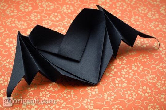
I liked it and realised it was a photo of something found on the web. I tracked the source to Go Origami. I decided to use the idea and create a winged bat in origami for my daily create today.
I found a You Tube Tutorial, of course! I followed it and made my first origami figure!
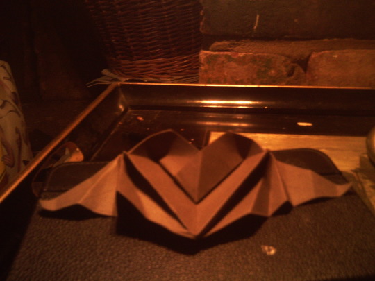
and also made a little friend for the bat.
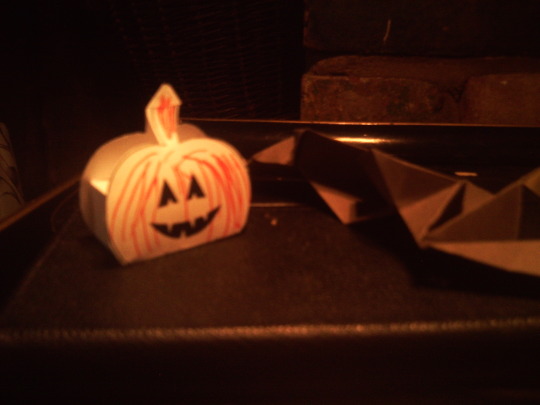
Total time 1 hour. I am wondering about the new Daily Create WordPress theme.
It seems to encourage ‘responses’ that are only a tweet, often containing unattributed images and no actual creation involved – unless we take the ability to send a tweet as creating? I wonder if we need to rephrase ‘my response to today’s daily create is…’. Something more like ‘post a link to what you create today to Twitter’.
The old site was designed to make this clearer. For example, Flickr is clearly a place for one’s own photos – posting there first makes it clear that the response expected is one’s own creation as a result of the prompt. The writing prompts offered an editor form for people to write a story, this made it clear that the prompt ‘write a story’ meant more than write 140 characters ::thinking::
Happy Halloween y’all!
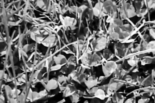

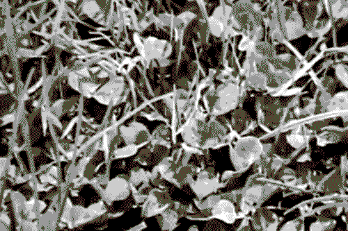
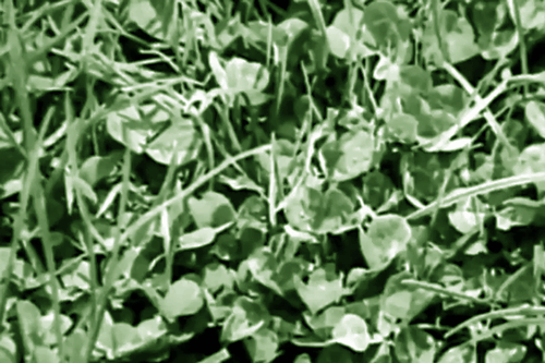
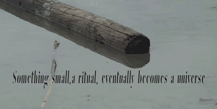
“Sit alone and watch a small patch of grass, to observe and record ‘what
happens there’. Stay with your patch of grass long enough to get to know it.”
Anne
McCrary Sullivan
Source Video: Grass and Conservation from Archives CCBY at Digital NZ


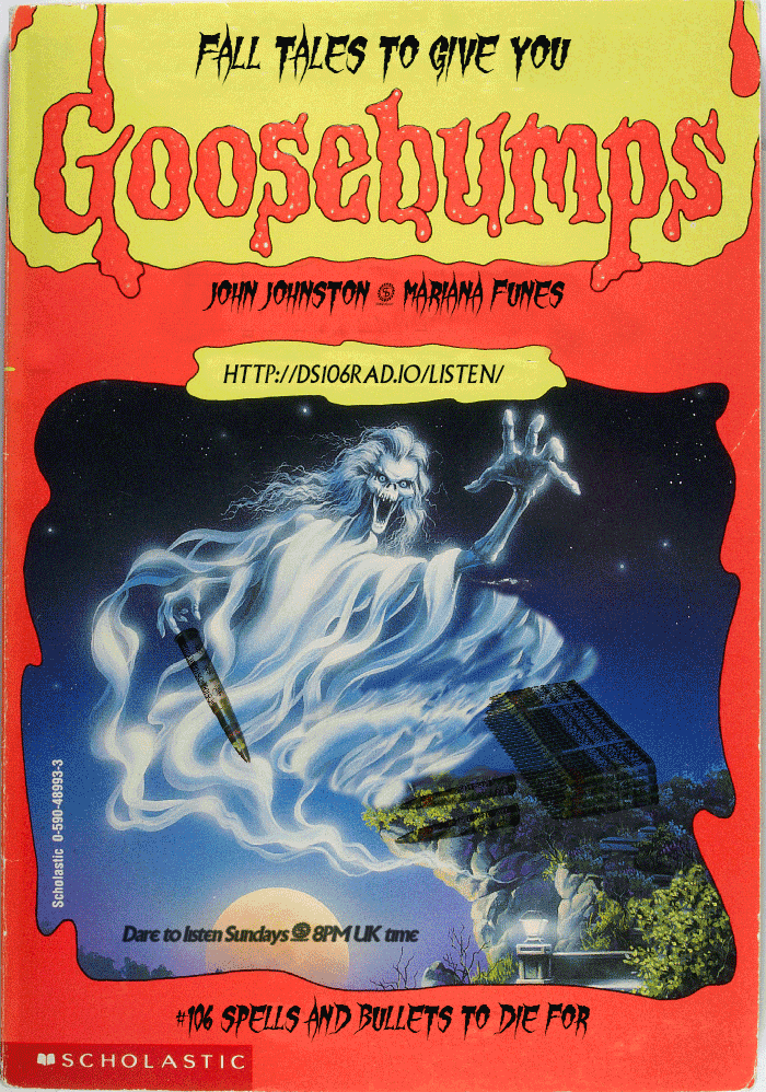
DS106 tales is up and running….scared.
An assignment went up about DS106 as a Stine book and I had never heard of Goosebumps! I confess I love horror as a genre, for reasons to explain another time. So, I went to mother google for answers.
As I think this may be an assignment UMW students do when course formally starts at the university, I am outlining my process in detail in this post. I personally prefer how-I-did-it-posts that offer clear bullets (bullet points that is), so I am doing that here. As bullets in this case imply an order, below is a numbered list of what I did and another one about what I would change. Start self-assessing your work early, boys and ghouls, best way to learn. If I could press rewind and redo: What would I change? Makes it easier for others to make improvement suggestions too!
What I did
1. Find out what these books are on Wikepedia
2. Google ‘Goosebumps book covers’ to get an idea of design assignment is after. I was taken by the notion of ‘creating an appropriate title’. I have not read the books so had to go with parsing lots of titles to get feel for it
3. I learnt there are many series to choose from, that Stine book covers are a thing and many people collect them and love them
4. Found a cover that suited my purposes. Now, find a high resolution file. This took some searching but Neil came through! A true fan
5. Find font. Here one could go mad as clearly fonts had to be extreme horror. I was also searching for legibility as my purpose was to use the cover as a poster for an actual radio show. I settled for Gypsy Curse but there are so many free fonts to choose from. Just google ‘horror free font’ and be damned
6. Install font in your editor.
7. Load up all the images you want to use for the creative edit as layers in one file in your editor. I use Photoshop. #EZPZ here: File <Scripts <load file into stack
8. Make sure you know where files come from for correct attribution: My main image came from Neil, the bullets came from jjgifs in his other blog.
9. Now time to play boys and ghouls!
10. This is where the screencast would be if I was doing a tutorial. I played for a long time with Photoshop. Main tools used: Clone stamp tool to clear from original image what I did not want. Healing brush tool to tidy up. Blending option multiply to blend bullets into main background. Skew tool (used badly) to make bullet stack blend more into image. And a word of advise: always find you pink guides! Guides to align everything exist in most editor, find them. They are a life saver.
11. Now play with fonts. I used Gypsy Curse but applied several options using the cmdT option with text selected. I also used blending options to highlight text like the time for the show. For legibility I decided to use Village plain (homage to a previous DS106 run) on URL and times. Little squiggle that divides names did not exist in Village plain. Copy/paste hopefully blended the fonts a little better when added to time information.
What I would do differently
1. I need to learn how to use that Skew tool properly – I cannot get the bullets to appear as if they are lying on the rock
2. Multiply was okay to blend but there must be a way to make the bullets show up more clearly
3. I spent a long time thinking about the title. The curse of DS106 Horror Show got me last night and I lost all my work. I thought of a title this morning, but I am convinced the one last night was better…the serious design point is that it mattered that in the assignment we are pointed to think about that – it is the thing that pulls the cover together
4. I decided early on not to do the back cover, I think it should be possible to create a poster with both sides of cover and I would have more space to say what is coming in the new season of the show….this has taken long enough for now
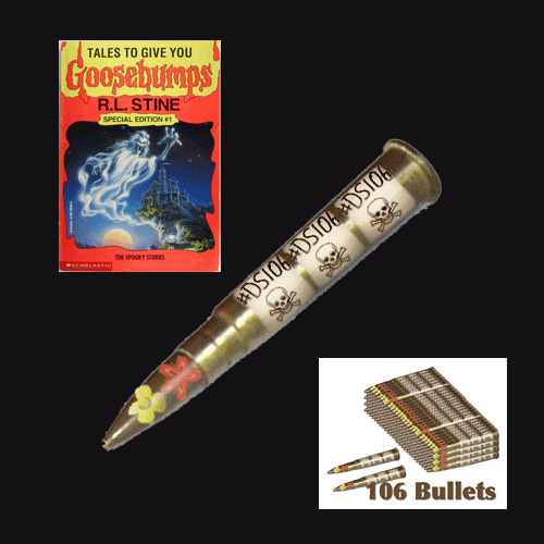
Update!

I did another version trying to improve visibility DS106 Bullets, the wording of the poster with accurate hashtag at the top and a better book title.
Finally, our new season of #106spell starts on September 6th, make sure you listen!
Just a little story about serendipitous connections on Twitter around another daily create. I wrote about this the other day and this is the story told for cogdogblog and his stories of open sharing.
Behind the scenes
Hmmm… Don’t ask.
It was going to be my first black background video. It was not to be. I learnt that making video with back background that do not make one look like a ghost is just plain difficult. I then tried Touchcast on the iPad. Well, I should know better. I am sure the app is cool once you learn to use it but
So I decided the ‘easy’ way would be to create it in Animoto.
I have made one other video sucessfully on Animoto, but have tried several that #bigfail. It is not a transparent platform it has many rules that are there to encourage you to upgrade and you often get stuck after you have gone to far into your project to ditch it. I refuse to collude with dishonest commercial behaviour so I ditch the project rather than be forced to pay. I have an education account, you would think they would behave transparently, they do not.
This time i worked out all their rules. Clip length, audio length, number of songs (1), free theme, total length of video allowed, maximum size, size of photos…. and I am not kidding!
The damn editor still cut my soundtrack by 2 seconds. I could not get around the problem in their editor. I think it has something to do with the addition of their logo at the end but i was not going to be forced into another way of paying to test that out. I rendered the video with faulty sound track and downloaded it.
I then brought it into iMovie and edited it. Detach soundtrack, add new on, shift a few clips to make it flow, add titles and a little music. Bob is your uncle, as we say in the UK. Done.
What is annoying is that it has a lot of potential. Animoto that is. If only they gave clear free options and then offered upgrades. They even try to force you to upgrade for better quality video download. If I wanted that I would have asked for that when I signed up!
Come back One True Media! That was a fast and easy way to produce video, and I did not mind paying them. They still went to the island of dead tools…go figure.
(Source: https://player.vimeo.com/)
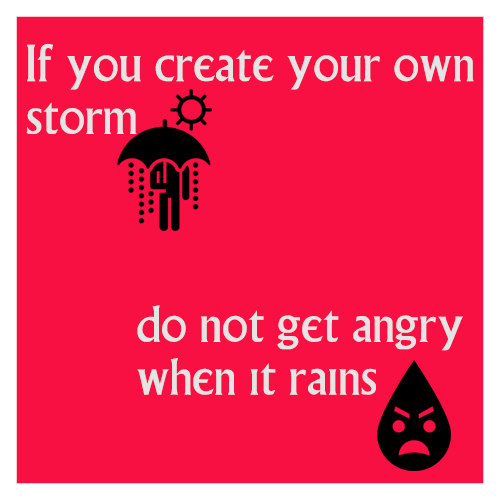
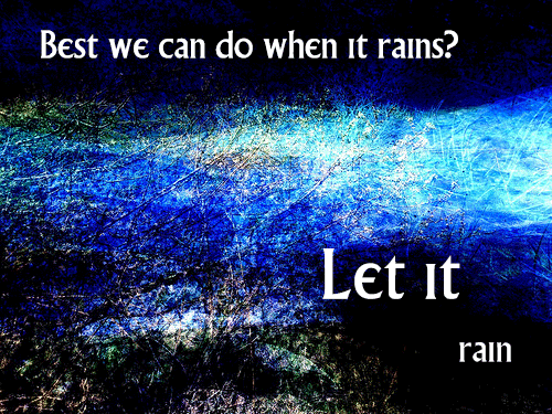

I did two posters yesterday for the Daily Create.
It was such a struggle. We were supposed to be wax lyrical about rain and I could not find it in me to make anything positive about rain. jjgifs had made an image showing just how wonderful (not) UK summer can be.

I looked at many options and nothing appealed. Back to basics. The series of typography posters I am working on. Find appropriate words that did not praise rain as that is how I was feeling and templates I have used in the past. Add lovely Noun Project icons and John’s photos – Bob’s your uncle. Done.