DS106 on the couch

Tag: artonthecouch (page 1 of 2)

Art on the couch rides again!

Inspired by John Johnston’s post last week, I dusted the #artonthecouch tag and decided to do an art critique on one of the gifs I liked the most since Western 106 started. You can view more detail about the questions  and read the original post if this is your first encounter with  #artonthecouch. You can always submit art for us to put on the couch if you want to!

Essentially, a few of us are trying to learn how to pay attention to art in a more informed way. The questions are from Marvin Bartel and our frame for it comes from the Art Assignment:

“But first, let’s talk about why we should critique in the first place. Because it’s the Internet, and you can anonymously say whatever you want? I’d say no. Because you like to change the minds of the person you’re critiquing? Definitely no. Critique is often most instructive for the person offering it. In looking at other people’s work, and formulating your opinion of it, you’re learning a great deal”

and that is that. 

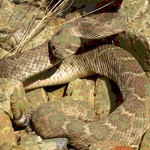
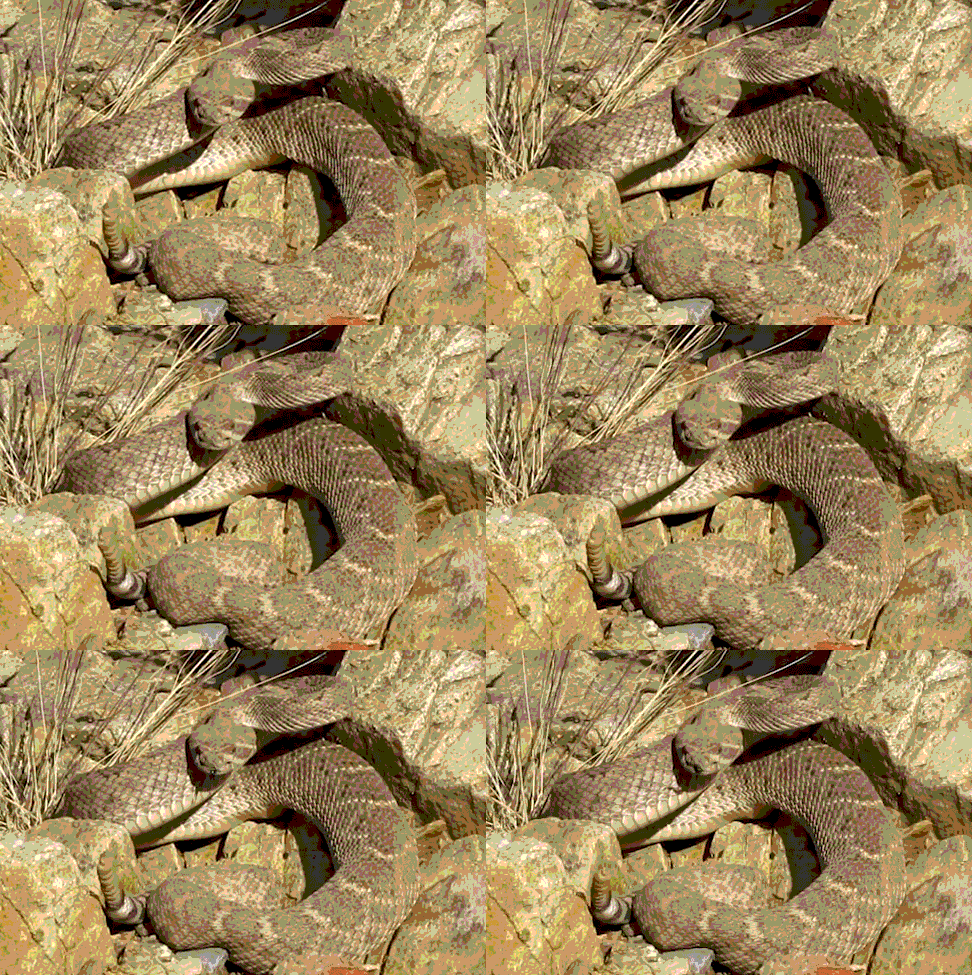
Mark’s second animated gif –  #artonthecouch answers

I had to edit gif to load on Tumblr. Please see original on Mark’s blog.

I was really struck by Mark’s animated gif. I kept looking at it and enjoying it, I could not explain why as snakes are not my favourite creatures. I wanted to spend more time with it to explore my response to Mark’s art more deeply.

1. What stands out the most when you first see it?

The tail of the snake almost dancing out of the picture is what stood out for me most. 

2. Explain the reason you notice the thing you mention in number 1.

I was also struck by the uniformity of colour, it is as if you are not supposed to see anything moving at all and then suddenly the tail jumps out at you. The snake blends into the rocks which is what it does in real life, the gif portrays this well with colour and cropping.

3. As you keep looking, what else seems important?

The rhythm of breathing of the snake mirrored in frame speed and I was drawn to breathing and tongue coming out, the only thing that is a different colour. 

4. Why does the thing you mention in number 3 seem important?

The black tongue says ‘danger’ and stands out of the frame in a different direction to the tail, and I can see it is a forked tongue! I imagine the artist wanted to convey the sense of danger of a snake of this type.

5. How has contrast been used?

In a way it is the lack of contrast that gives it power, it is as if it surprises the viewer as one looks at a uniform colour and what seems like just rocks on first viewing.

6. What leads your eye around from place to place?

The snake and the rocks are connected by the same colour and markings this makes the viewer look and look again. Is something moving? Is it just rocks? 

7. What tells you about the style used by this artist?

The sharpness, close framing speaks to realism. Making me almost feel the dry heat as if I was walking on a path and had actually seen it as I walk.

8.What seems to be hiding in this composition and why?

As I keep looking I notice the dry grass is moving too. I had initially thought the snake was the only thing moving and the rest had been masked as if a cinemagraph. The why may be about meaning: the grass moving helps the sense of the snake hiding in the rocks or it may be about technique, this is Mark’s second gif and masking may be something he has to play with yet.

9. Imagine the feelings and meanings this artwork represents?

‘DANGER! Keep out!’ What is interesting is that it catches a moment before anything happens and gives the viewer a sense of danger pending. We can run away…only if we are quick enough.  

10. What other titles could you give this artwork?

’Just hanging out in the sun’ ‘Now you see me, now you don’t’ ‘The west that is’

11. What other things interest you about this artwork?

I wonder about masking the grass so only snake moves, would it reduce or add to sense of danger? I also wonder about panning out so we can see more of the environment, would it detract or add to the surprise that the snake is moving in the image?

I have been making gif art for a long time now, a key thing for me is always this idea of ‘catching a moment’ – the frame selection is so precise and clean, the timing of the frames just so, this is what I see as its most powerful pull for us as viewers. Thank you, Mark.  
three seasons. (final story)

rockylou22:

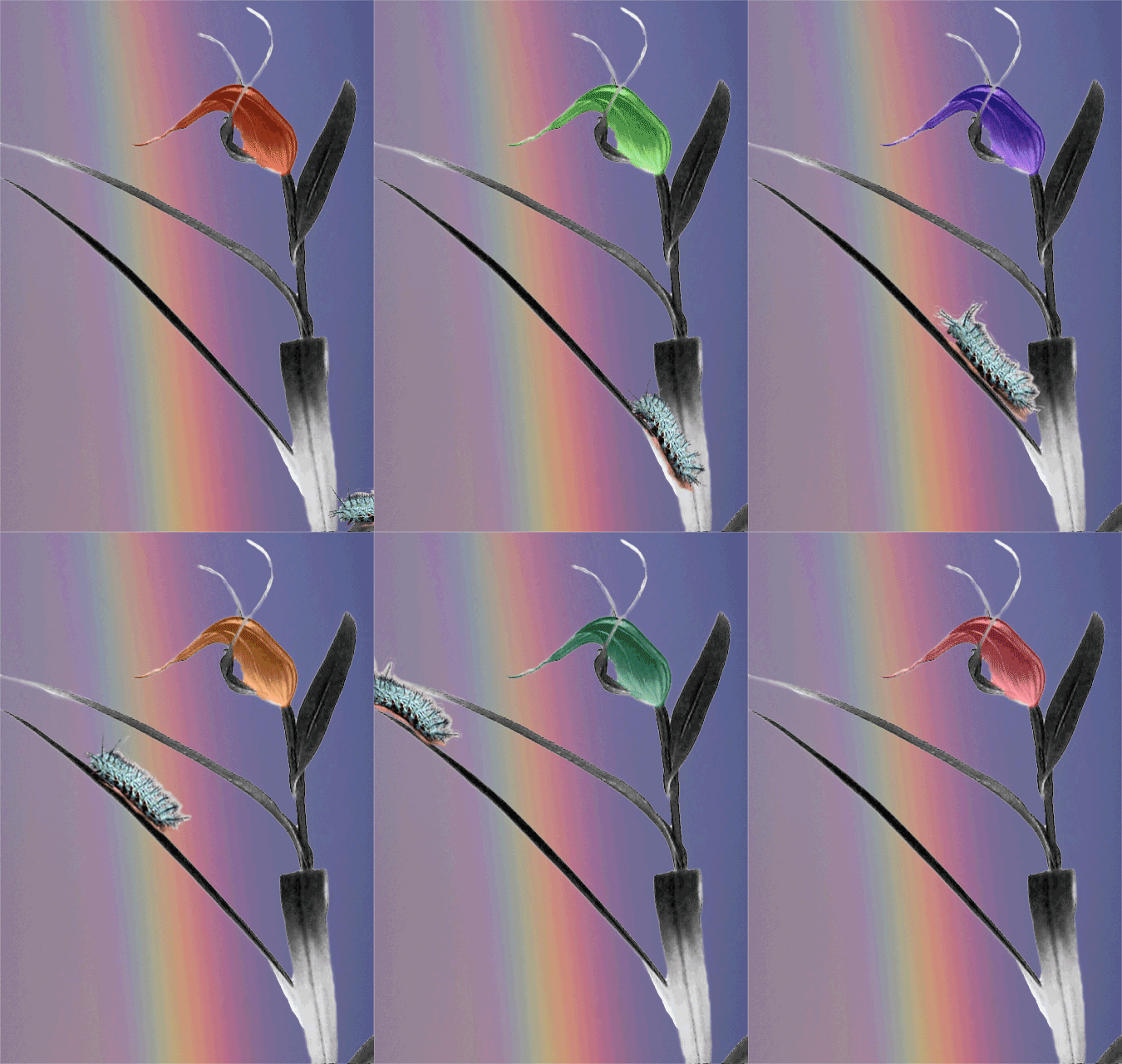
Rainbow Flower Power – take 3 for GIFFight and Gif it Up 

Flower source image from the Museum of New Zealand

Background image “Rainbow” by Evan Leeson by-nc-sa 2.0 https://flic.kr/p/eovqWK

“radioactive” turquoise caterpillar GIF (CC-By-SA) courtesy of Alan Levine (@cogdog)

Art on the couch critique

What strikes me on first seeing this lovely gif are the changing colours of the flower which pick up the background rainbow colours. The lines of the rainbow flow in the same upward direction as the flower and complement it.   I notice the colours as they seem other-worldly and contrast strongly with the neutral flower stem and leaves. The rainbow adds depth to the composition. As your eye is drawn to the changing colours in the flower and the rainbow, the caterpillar surprises you and appears to create balance. A 3-way attention point: Rainbow, flower, caterpillar against the neutral stem. The fine threads in grey around the flower add contrast in stillness as the flower inside bursts with life. 

The movement of the caterpillar seems important and adds realism to an otherwise ethereal composition. What gives it the ethereal quality may be that the colours chosen by the artist do not exist in nature. We recognise a flower and a caterpillar yet the colours do not belong. It seems as if the natural elements put a barrier up for the viewer, we cannot reach the end of the rainbow. This effect is added to by the blurry nature of the rainbow. Then there is the creation of depth by the caterpillar appearing in the corner and seeming to go ‘into’ the picture nearest to the viewer. This makes it seem like the flower is behind the caterpillar and this in turn adds to the sense of the rainbow being unreachable. 

Given the title one assumes the choice of colour was intended to give the composition a pop-art style. The flower is out of any context, there are no frames to locate the work, adding to its detached feel. I imagine it as a flower that would belong in a biosphere 2 experiment of the future or a science fiction movie. My alternative title: ‘Life thrives anywhere’. 

Creative commons licensed (BY-NC-SA) flickr photo by troutcolor: http://flickr.com/photos/troutcolor/15719237262

What stood out when I first saw it was the texture of the sky and the position of the sky, it is in the ‘wrong’ place. Also, the bright red in the middle and the sharp blue beyond the could – great contrast. The main reason this strikes the viewer is contrast between the colours and the conflict between where we know the sky to be and where it is positioned in the photo. What stands out is that whilst we know there is water there, we cannot see water, only sky and ships that ‘should’ be on the water. The mind is confused.

The colour of the clouds – pinky red. Fluffy, makes me want to touch them and this seem important as it gives texture to the photo. The top/bottom positioning is inverted and this draws the attention in. A key contrast seems the bright red dot in the mostly blue photo.

Depth works in a mysterious way to my untrained eye. I see the cloud close to me, land further way and then I see sky even further away. This is not how looking at a scene like this in real life would look – so you are pulled in to resolve the conflict between the ‘seen’ and the ‘real’. It has a surreal feel to it and yet a warmth from the lovely fluffy clouds.

What is not obvious is where the photo was taken from. No sense of the photographer or what is around him.

As I look at the photo I feel detachment, a sense of perspective and a sense of my givens being challenged. Literally and metaphorically – the sky does not belong down below and yet my eyes deceive me. My rigid views challenged as I have to stop and take a second look. I would call it ‘The impossible sky’.

I keep want it to edit the photo and remove the rail at the bottom. I might do that at some point to understand what is making me want to do it. 

If you want to know more about this Art on the Couch project, you can read my first post or click on the hashtag to see all the post on this blog relating to it. 

There are no Commandments in art and no easy axioms for art appreciation. “Do I like this?” is the question anyone should ask themselves at the moment of confrontation with the picture. But if “yes,” why “yes”? and if “no,” why “no”? The obvious direct emotional response is never simple, and ninety-nine times out of a hundred, the “yes” or “no” has nothing at all to do with the picture in its own right.

“I don’t understand this poem”
“I never listen to classical music”
“I don’t like this picture”
are common enough statements but not ones that tell us anything about books, painting, or music. They are statements that tell us something about the speaker. That should be obvious, but in fact, such statements are offered as criticisms of art, as evidence against, not least because the ignorant, the lazy, or the plain confused are not likely to want to admit themselves as such. We hear a lot about the arrogance of the artist but nothing about the arrogance of the audience. The audience, who have not done the work, who have not taken any risks, whose life and livelihood are not bound up at every moment with what they are making, who have given no thought to the medium or the method, will glance up, flick through, chatter over the opening chords, then snap their fingers and walk away like some monstrous Roman tyrant.

Jeanette Winterson on ignorance vs. distaste and how learning to speak the language of art transforms us – one of the best things I’ve read in years. (via explore-blog)

#artonthecouch #ds106 A great read to learn more about art critique. There is really so much to learn to do this well. Tentative steps to concluding that this may be a way into developing one’s emotional intelligence. Awareness of our feelings and an ability to describe without attributing what we feel to an external stimulus seem key in what I am reading. Takes courage.

Practising Reflection

This is relevant to my #artonthecouch project. What did I think of this episode? It was [fill blank with overused superlative of choice] I will write more on this soon. I wanted to post it here so as not to lose it. Some kind soul on Twitter directed me to it, but I found it in a tab at end of the day. Thank you whoever you were. You were…I can’t even…literally…

The wire” a poem by Melinda Albrycht

DS106 Art on the couch – critique

When I first heard the poem on sound cloud it was the voice, the depth of the voice that stood out for me the most. I wondered how to do an art critique with audio art. So I went googling. I guessed that music might offer some constructs to comments. 

From my explorations I get that the tempo of the voice is steady and this is what brings me in. The monophonic nature of the voice has a hypnotic effect and I also notice, on hearing again, that there is a rhythm to Melinda’s voice as she read her poem, it becomes almost a song.

Is this what people refer to as a melodic voice? When she talks about the losses in the game, one can almost tap to ‘the music’ of her voice.  Repetition is used to great effect in this part of the poem to create the sense of hopelessness in playing this game.

I found it interesting to compare the written words with the performed words. ‘Look again’ says the text. ‘Look again, player.’ says Melinda’s voice. ‘Player’ added to keep the rhythm in the voice I am guessing.

The last part of the poem has a different tempo. I am not sure how to interpret that, I just noticed it. I notice the change comes when she says ‘Look again’. May be this looking again gives new information and this is shown by the change in tempo in the quality of the voice and the cadence of the words?

The voice is used to convey the emotion of the words. The contrast between the possibilities when we play a game is marked with the change in tone. As we are losing the game, the option comes up to win it. But if you think you can win it, think again. Nobody does. Can I win? Will I lose? Can I leave the game? There really is only one choice, if you play on the wire you will always lose. 

It is that dangerous.

The poem starts with ‘walking the wire’ and ends with ‘playing on the wire’. A way to bring closure to it? a kind of circle that keep going in a never ending cycle of despair?  

The poem has a realistic and expressive style.

Unless you have seen the TV series, ‘The wire’ and what the wire is is hidden from the composition. Yet it stands alone as a description of a kind of life style that leads to the destruction of life. Anyone ‘hanging by the wire’ is in danger. The poem brings up despair and hopelessness blended with a sarcastic ‘gotcha’ flavour – just think again, player.

And now for the informal critique: I thought it was so bloody good (as we say in the UK, Melinda) that I wished I had written it myself. 

If you want to know why I am doing this and how you can join in, read this post

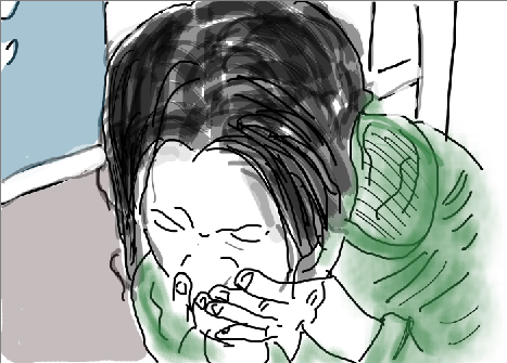
“Sketch a Screenshot” by Lauren Brumfield

DS106 Art on the couch – critique

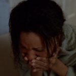
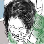
The similarity between the screenshot and the sketch stands out once you put the two pieces together. Yet what drew my attention to the sketch initially were the colours and the emotion it expressed. It was not until I went to see the original from our DS106 site that I learnt it was a ‘sketch a screenshot’ assignment.

The contrast between the dark hair and the green clothes say ‘extreme’ to me. The centrality of the subject and the ‘close up’ style say ‘high drama’ to me. As I keep looking the expression of the eyes jumps out at me; the stark sketching lines speak of a ‘stark’ state of mind in the subject. The stark contrast seems to be between green, white, black. This draws attention to the centre of the piece and made me wonder what is wrong with her. 

As I focus on the centre, I want to pull away from the piece. Too distressing to ‘stay’ in the artwork. Yet, there is nothing else in the sketch to focus on, the background is bare. This seems to be how tension is held – the viewer wants to pull away and yet cannot. 

A very expressive piece with lots of feeling.

The background and any sense of why the distress of the subject are hiding from this composition. Leaves viewer wondering why the distress and despair. I imagine potential titles for the artwork might be: Why? Make it stop. I can’t take this no more.

Once I saw the screenshot, I could see that it has been faithfully reproduced in the sketch. I am not familiar with the series the screenshot came from. I would be interested to learn if what I ‘took’ from the sketch is in any way connected with what was going on in the episode.

if you want to know why I am doing this and how you can join in, read this post.

Art on the DS106 couch: Veggie Tales

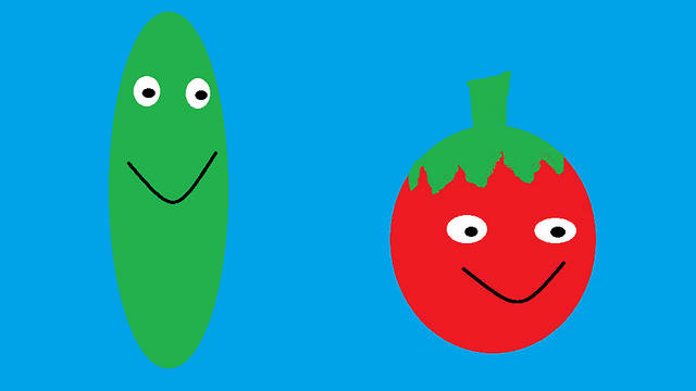
By Bianca Brown  Click here to go to it on Flickr.

My first critique

What caught my attention was the bright background blue. Also the contrast between the subject (the cartoon vegetables) and the background. The background seems to take up the largest area in the composition and this is quite striking. I notice the title of the composition and connect that with the subject matter – the cartoon like veggies are smiling and have been anthropomorphised and the composition is titled Veggie Tales. 

It seems the artist wants the viewer to think that there is a story behind the photo. The Veggies have many tales to tell. Once you notice the background the next thing that jumps out at you is the big smile on the subject, the Veggies. The shape of the Veggies contrasts strongly. One tall and thin and the other round and short. The red, green and blue are being contrasted to grab the attention.

The two Veggies are connected via the shared green colour. The smile is the also same so the two characters seem ‘related’ in some way. Yet the eyes are different, one round the other oval.  There is no symmetry in colour, I half expected some red in the tall Veggie but it was not added by the artist.

The over all style is naive . Like a children’s book illustration. The faces of the characters are expressive but clearly imaginary not realistic. The whole thing is very bright but colours are stark not blended. Sharp lines.  The only organic lines are in the top of the tomato which is the colour that is shared by the two characters. 

The placement of the eyes seems to suggest that they are looking at something off the scene. Whatever it is the characters are looking at is hidden from the scene but seems to be making the characters smile. So that make one interested in what might happen in the next frame.

The feelings that seem to emerge on looking are: Cheerful, light, simple kids story. What might be other titles for this composition? “The Veggies extraordinary adventures” “The Veggies find their fruit” “The happy Veggies”

Overall what draws me to it are the simple and clean lines. The shape of the frame rectangular not square, somehow adds interest.

Narrate your process

So what was my first critique experience like? Really tough. I got the random daily create and I must admit that I would not normally spend any time looking at variously shaped vegetables. I wanted to keep to my process to find some learning and go against my leanings of wanting to pick something else.

So, I looked at the submissions for this daily create and picked one that drew my attention. I wanted the process of filling in the art critique Google form to be a discovery about why it had drawn my attention. 

It worked. I followed the questions as set and kept looking at the piece to answer the questions. The more I looked the more I could see in it even when I had started with a preconception that is was a kind of ‘throwaway’ clip art type image. I would not choose it for my living room, but I understand why it got my attention.

If you want to know why I am doing this Click here

Olderposts

Copyright © 2024 DS106 on the couch

Theme by Anders NorenUp ↑