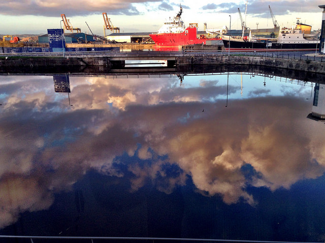
Creative commons licensed (BY-NC-SA) flickr photo by troutcolor: http://flickr.com/photos/troutcolor/15719237262
What stood out when I first saw it was the texture of the sky and the position of the sky, it is in the ‘wrong’ place. Also, the bright red in the middle and the sharp blue beyond the could – great contrast. The main reason this strikes the viewer is contrast between the colours and the conflict between where we know the sky to be and where it is positioned in the photo. What stands out is that whilst we know there is water there, we cannot see water, only sky and ships that ‘should’ be on the water. The mind is confused.
The colour of the clouds – pinky red. Fluffy, makes me want to touch them and this seem important as it gives texture to the photo. The top/bottom positioning is inverted and this draws the attention in. A key contrast seems the bright red dot in the mostly blue photo.
Depth works in a mysterious way to my untrained eye. I see the cloud close to me, land further way and then I see sky even further away. This is not how looking at a scene like this in real life would look – so you are pulled in to resolve the conflict between the ‘seen’ and the ‘real’. It has a surreal feel to it and yet a warmth from the lovely fluffy clouds.
What is not obvious is where the photo was taken from. No sense of the photographer or what is around him.
As I look at the photo I feel detachment, a sense of perspective and a sense of my givens being challenged. Literally and metaphorically – the sky does not belong down below and yet my eyes deceive me. My rigid views challenged as I have to stop and take a second look. I would call it ‘The impossible sky’.
I keep want it to edit the photo and remove the rail at the bottom. I might do that at some point to understand what is making me want to do it.
If you want to know more about this Art on the Couch project, you can read my first post or click on the hashtag to see all the post on this blog relating to it.
Leave a Reply