So says Donald Norman. Good design taps into our happiness pathways and is evaluated mostly unconsciously with a small element of conscious reflection that makes us chose certain things that may not perform a function because our super-ego says we should – like buying an ecological car that only travels 50 miles before needing recharging. We buy it because it fits our espoused theories of action. So we have the object, yet remain unhappy with it. We give allegiance to the idea of caring for the environment, but operate from a theory in use that values comfort and speed. So, mental models clash. Humans are not rational animals in making decisions about good design any more than they are rational about any other realm of life.
So, how do we teach design? How do we help students to distinguish a website that sucks from one that can be said to meet good design criteria? In DS106 we were encouraged during design week to look at examples, many examples, over and over again more examples. What this implies from a learning perspective is that Donald Norman is right in saying that the principles of good design are below awareness. If we want to learn good design we need to develop a practice of attention to help us bring to awareness the principles we use to evaluate ‘good’ and create heuristics to help others learn perceptual patterns that are labelled as ‘good’ in our culture. A tough job at the best of times. In DS106 even harder because we look at many different types of design in a short period of time – industrial design, graphic design, photo design, audio, website design, story design, interaction design, etc.
For my learning I chose to focus on surfacing my own implicit values for ‘good design’. The rest of this post looks at design week assignments and how I used them to start to answer the question: What is good design for me? First, a short story that encapsulates a key criterion of what counts as good design from my world-view,
At the metacognitive level I realise I hold a strong belief that there do exist absolute principles of design and that I do not subscribe to the relativist post-modern notion that beauty is subjective and anything can be seen as beautiful by somebody.
From my work in cognitive science I understand these absolutes to be tied to human perception and what the perceptual system affords as we interact with our environment. Of course there are individual differences here, but there are shared patterns too.
For example, symmetrical faces are perceived as more trustworthy and the brain has mechanisms to automatically detect novel faces and rate features as trustworthy (1) . We are pattern recognition machines, and not all patterns are created equal, even if the idealists amongst us may want any feature or pattern to have equal opportunity. I could turn this post into a review of the cognitive science literature that supports my assertion, but this blog is not for my academic work but for making sense of digital storytelling and it place in my own life. So, my assertion will have to stand and those interested can look at the research on mirror neurons, for example, as further evidence that pattern recognition is unconscious. We act differently depending on the patterns we perceive. Briefly, mirror neurons are sophisticated pattern detection mechanisms that enable us to learn without conscious attention by watching others act (2). There is also new evidence to suggest that there is a ‘neurology of aesthetics’ with core principles of what the brain interprets as aesthetically pleasing – such as grouping, symmetry, hypernormal stimuli, peak shift, isolation and perceptual problem solving – which ‘may cut across not only cultural boundaries but across species boundaries as well.’ (3) Different areas of the brain respond to elements of the visual arts such as colour, form, line, and motion, and hence our experience of art ‘relates strongly to the neuroanatomy of the visual cortex’(4).
This research matters because it shows that there are absolute principles in design and that these are tied to the nature of embodied cognition and the brain. Put simply it means there is pattern to what we like and what we dislike, it is not all subjective evaluation. There are many other issues at play in evaluating good design – culture, politics, peer pressure, in-group norms – but here I am just attending to cognition.
We learnt during visual week how using the principles of Gestalt psychology we could take better photographs (5) and these are not dissimilar to the neurology of aesthetic principles we just mentioned. I went searching this week and found out that Gestalt has also been applied to web design (6) and learnt that the guiding principle of Gestalt is often mis-translated as ‘the whole is greater than the sum of the parts’ that in fact in fact Koffka intended it to mean “The whole is other than the sum of its parts” and this implies that the whole is perceived as different from its component parts. The article suggest that when we design anything we can usefully and purposefully ask: What gestalt principle is this element of the design appealing to? This can allow us to self assess in a rigorous rather than self congratulatory manner anything we design. I found this idea very useful and plan to apply it to the artefacts I design in Ds106.
Further evidence for the cognitive underpinning of design comes for cognitive linguistics. A key slide from that presentation that connects with my own Phd research,
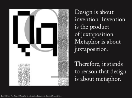
In my own work I define creativity as the process of bridging from one domain to another apparently unrelated – where the abstract gets mapped to concrete bodily metaphor (7). This is referred to as juxtaposition in Safer’s work above. The key here is that we understand via our bodies and how they experience the world. Interaction design uses metaphorical understanding to help make the tool or product invisible to the user if the right metaphor for understanding is applied. As is the case for, say, the desktop in our computers or the trash can as digital metaphors which map to embodied experience and map purposes across domains.
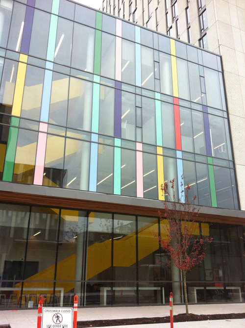
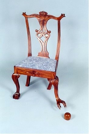
Our assignment for design week asked us to choose 4 elements of design and carry out a design safari – select images that represented the chosen elements. I chose:
1. Metaphor – understood as abstract concepts are grasped via embodied experience
2. Form and function – How do we blend form and function in that which we label ‘good design’?
3. Minimalism – for me understood as how do we get to the essence of things? This will give us components in a design that uniquely define/express a ‘thing’ – be it a film, a photo or website.
4. Balance – as an example of an embodied metaphor when we say good design has symmetrical or asymmetrical balance we are understanding it in relation to bodily balance.
We have learnt about many other design concepts – colour, typography, rhythm, proportion, dominance, unity. Many of them grounded on gestalt psychology. I am no designer but have always attended to design around me and have an in-depth understanding of embodied cognition and how it grounds all human endeavour.
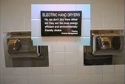
My reading and watching for design week (e.g. Helvetica and Objectified) also offered up other interesting design principles. I loved the definition of design as ‘the search for form’. Other principles that resonated with my own sense of good design were: invisibility, simplicity, non-disposability.
The designers interviewed on the films wondered: Is the aim to differentiate yourself or to contribute to the world of design? Should we be going back to designing according to the principle of things that get better with use rather be willing to dispose just to differentiate ourselves and our products?
After my study for design week, I was left asking: How are Wabi-sabi principles useful in expressing what I value in design? Wabi-sabi contains the idea that the aim of design is for it to dissolve in natural behaviour and this is similar to the invisibility principle I believe in strongly in user interface and website design. As a buddhist it is perhaps not surprising that I value wabi-sabi aesthetics or see its application to wider ecological issues in western design.
I was struck by a designer saying that almost all design ends up as landfill today and that designers must now consider sustainability and non-disposability . This links for me with a personal, but only just emerging, view about the negative consequences of encouraging the constant production of content for the web. So much of it is just regurgitation of old ideas with not thought to research or good design – I am using the metaphor of the virtual landfill to make sense of this. We encourage (particularly in the open education movement) a sense of entitlement for the creation of virtual spaces – without rigour in design or content at times. May be designing content with appeal to a non-disposability principle would give us more reciprocal hyperlinks and less withering domains,
“My hunch is most people do not consider that there are implications for this, the missing part of the original dream of hyperlinks as being bi-directional.”
Of course bi-directionality does not speak to quality. It does, however, speak to the importance of a longevity principle at least. This is an evolving theme for me, one I will come back to it in later posts. It connects for me with what I believe to be the dysfunctional relationship to time in our culture.
So, here we go, our design safari. I used SlideSpeech to add audio to the photos. It is in alpha so there were some glitches but you can hear the computer generated commentary for the photos by clicking on this link. I love this tool and have used it in my work as it can quickly produce great output. I have ran the slides with commentary on my computer, created a screencast and uploaded to YouTube for work projects. SlideSpeech is an example of a focussed tool, designed to blend with the user rather than for the user to adapt to it. We all make powerpoint presentations, and just adding key presenter notes gives you a decent artefact.
A nice feature I have not managed to get to work yet is that you can add interactivity to your artefact and offer your listener extra resources to follow up. Check this simple tutorial produced with SlideSpeech to learn how to use it. I will come back to it and want to support John Graves to further develop it by using it as much as I can – it will be a great tool soon.
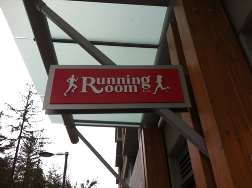
Design week has opened my eyes to design beyond software and I notice that I am noticing the language of design used around me much more. For example, symbolism in advertising,
Bibliography
1.Engell, A. D., Haxby, J. V., & Todorov, A. (2007). Implicit Trustworthiness Decisions: Automatic Coding of Face Properties in the Human Amygdala. Journal Of Cognitive Neuroscience, 19(9), 1508-1519.
2. Ramachandran, V. (2013) The neurons that shaped civilisation. http://www.ted.com/talks/vs_ramachandran_the_neurons_that_shaped_civilization.html
3. Ramachandran, V. (2008). The Neurology of Aesthetics. (cover story). Scientific American Special Edition, 18(2), 74-77.
(4) Zeki, S, Inner Vision: An Exploration of Art and the Brain. Oxford University Press, 2000.
(5) Baraban, J. (2012) 6 Principles of Gestalt Psychology That Can Improve Your Photography http://www.adorama.com/alc/0013706/article/6-Principles-of-Gestalt-Psychology-That-Can-Improve-Your-Photography
(6) Tuck, M. (2010) Gestalt Principles Applied in Design http://sixrevisions.com/web_design/gestalt-principles-applied-in-design/
(7) Funes M. (2003) Bridging: The essence of Creativity. European Association for Creativity and Innovation. In: Jon Buijs, Remko van der Lugt, Han van der Meer, Idea Safari: Proceedings of the 7th European Conference on Creativity and Innovation, 2003.