Design week started yesterday and I could not get my ‘pointy head’ around it. Each week I feel utterly inadequate for a while and then just get on with the work. This time my first assignment choice was the minimalist poster.
I found myself in the same old pattern Seth mentions in his post in relation to this assignment:
I immediately applied my old thinking to the question/problem and nearly dismissed the assignment as super-simple (a bore really)…and then I began to reflect a little. And I found that I couldn’t quite get my pointy head around it.
I too took the day to reflect a little. The usual self-talk kicked in – I am no graphic designer, a stupid idea anyway, what can I learn in a week and I just don’t know how to make a poster anyway. Thankfully I know how to walk beside these patterns rather than own them. I just let the inner self-talk be whilst I watched Helvetica and Objectified and was blown away by amazing designers and their passion for what they do. I found myself falling in love with helvetica and hating it both – depending on the designer I was listening to; understanding that may be I wanted to be a designer all my life, I just did not know it. Somebody in the film says that designers are like doctors. Doctors fight disease and designers fight ugliness. Yes, I have always fought ugliness, I have a deep sense for preserving beauty and elegance in solutions – be it programming, learning design or objects around me. I have always thought of this as an unnecessary quirk, never as a something that could have become a trade. As I listened, I was also made aware of how little I consciously understood about design. What are the criteria that make something beautiful and elegant in my life?
I then read an article about Google. When asked
what beauty means for Google, they’d eventually settle on an answer that involved the idea of simplicity and, deeper than that, of invisibility.
This resonated with me and brought me back to the poster assignment. It is because simplicity and invisibility seem core criteria for good design to me, that I was attracted to the poster idea and also to the idea of the 4 icons assignment. Reminding myself once more that as a beginner my taste and execution may not align, I decided to tackle both these assignments as one poster. The rest of this post gives an overview of the process that led to the poster above.
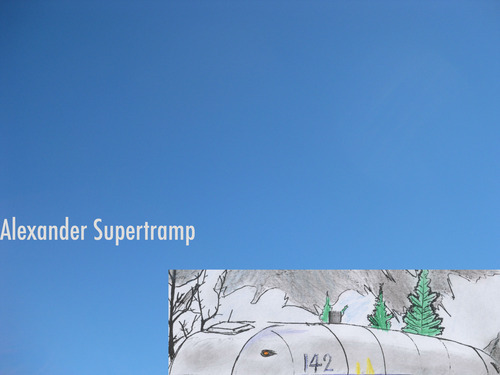
I went for an evening walk with Colin-dog and reflected on favourite movies and the icons that would represent them. I settled on ‘Into the wild’ and selected 4 icons that would tell the story: Alexander Supertramp, the magic bus, big skies, and ‘happiness only real when it is shared’. Clearly, those 4 things told the essence of the story. I started to reflect on how to choose a font that would emote tragedy and impermanence – the futility of a search when life chooses for us. Helvetica was not for that, I thought as I put the key in my front door.
I then came to my computer and started to search for what other people had done. I was surprised that the actual poster for the film had most of the same symbols I had picked. I was surprised to learn that minimalist movie posters are a pastime for many and that others had done beautiful posters for this same film. The arrogance of mind to think itself the discoverer of fire each time an idea occurs…I nearly gave up and just posted the examples I found. They were better than anything i have the skill to produce. But I didn’t give up.
I started to think about layout, about layers in Photoshop, about fonts. I visited what the font with various samples of fonts from the original poster and others. What a great resource, I could spend days just submitting images and get it to generate fonts. In the end I chose Futura as the one that matched best what others had used – I figured they knew better.
I then remembered one of my favourite photos from visual week and bingo I had my background layer. I wanted big skies but I also wanted the warmth of real skies not just a colour – So Karen’s photo fitted just right.
I then wanted photos of the magic bus – I thought I might do some inverting or desaturation of the original photo to make it simpler and more ‘minimalist’. I then found this beautiful sketch. It was free to download so i have assumed that the author was giving permission for use. I wanted to have just a hint of the magic bus – so I selected the bus from the sketch.
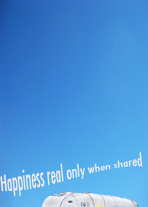
I found an animated gif of the final moment in the film when ‘happiness real only when shared’ is written in a book just before the main character dies. I played with that for hour – change the colours, get just one frame, smaller or bigger or…I chose to listen to my gut: It is done, don’t add any more to it.
So, the 4 items are: the sky, the number 142, the bus and the name he adopts to make his journey – Alexander Supertramp. Anyone who has seen the film would recognise this as iconic of the film, anyone who has not might be curious to see it and cursing me for having spoilt the ending. Apologies for that.
I learnt about layers, about fonts, about less is more, about how what looks just white to me can be infinite shades of white in Photoshop and, importantly for me, about some of the unconscious criteria that drive my sense of good design.
But if ‘The act of a safe landing is all the documentation we need’ then my learning will be judged on the poster I produced and not on the documentation of my learning. I wanted just the outline of the bus without the scenery – but I did not know how to erase the background and also keep the boundary lines clean. May be I will improve on it later in the week and see it as work in progress.
A new version after Feedback and a little help from my friends.
@mdvfunes What I say does not matter, but yes, I do like it– it invites curiosity rather than explanation.
— Alan Levine (@cogdog)
So, tah dah!
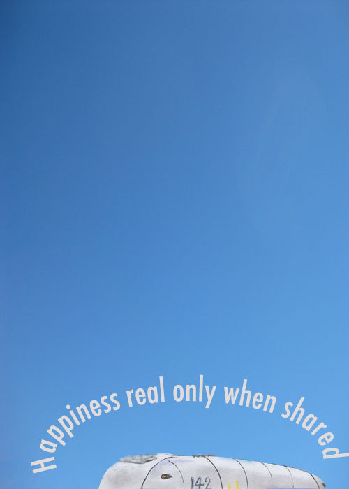
I used the magnetic lasso, but failed to select the bus from the original drawing. So, I cheated with clone tool and blur tool to hide (only a little) the flaws in the bus selection. I then used this tutorial to learn how to use the path selection tool and the text tool to get circular text. I would have wanted to get the text following exactly the shape of the bus, but I am now bored with minimalist posters.
Leave a Reply