DS106 on the couch

Tag: DesignAssignments

An open education conference I am attending in April asked us to create ‘a promo poster’ for it using our #ds106 digital skills. I am still uncertain as to what the brief is. I wonder if they want us to keep to their current theme of just make some fun posters. I went for fun posters! Others kept to the current theme – I hate that blue! 

I wanted an image that spoke of ‘open culture’ as this is the theme of the conference – I spent a long time searching in Wikimedia and other spaces for public domain images that were free to use. Found one. 

Poster 1

I also was not comfortable with highlighting keynote speakers as the ‘main event’ – for me the main event is about the whole community coming together to search their ideas and research. I wanted the poster to be about the perspective of a potential participant thinking about attending. The one way ticket idea, spoke to me in terms of how once you become an open online educator ‘there is not going back, it is a one way ticket’ – in one’s heart, at least. The tag line kept ringing in my head, it is probably lyrics to a song I heard long ago.  The Delicate font I found recently and love the open and minimal nature of it, it seemed the obvious choice. As the poster was a non-english movie poster the credits are in a language other than English, I chose to leave that as it was as it highlighted the idea that conferences are not (or should not be?) about personalities but about egoless dialogue. The poster highlights the theme and the participant – that is all. The image give the sense of endless ocean, marking the potential of ‘open culture’ in education. I love the simplicity of this one. 

Poster 2

I did the traditional thing and followed a template. The ‘movie’ has stars and they will pull the punters in. The stars at the top, the potential participant and his thoughts lower down in the image, with a smaller and fuzzier font. White highlight shows up the ‘stars’ that much more. I liked the PG rating – may not be suitable for children! This spoke to me about how we need to reflect on what it really means for our students to give informed consent to using open online education tools to learn. I really like how the OER16 logo hides behind the credits at the bottom. 

I guess what really makes both posters is the wonderful public domain image. The language is Azerbaijani and the image is for a movie poster in Azerbaijan

It has been a fun assignment, helped me reflect on how the narrative we chose to highlight in publicising conferences speaks to many of the norms that may need changing in the creation of an open culture in education. 

DS106 tales is up and running….scared. 

An assignment went up about DS106 as a Stine book and I had never heard of Goosebumps! I confess I love horror as a genre, for reasons to explain another time. So, I went to mother google for answers. 

As I think this may be an assignment UMW students do when course formally starts at the university, I am outlining my process in detail in this post. I personally prefer how-I-did-it-posts that offer clear bullets (bullet points that is), so I am doing that here. As bullets in this case imply an order, below is a numbered list of what I did and another one about what I would change. Start self-assessing your work early, boys and ghouls, best way to learn. If I could press rewind and redo: What would I change? Makes it easier for others to make improvement suggestions too!

What I did

1. Find out what these books are on Wikepedia

2. Google ‘Goosebumps book covers’ to get an idea of design assignment is after. I was taken by the notion of ‘creating an appropriate title’. I have not read the books so had to go with parsing lots of titles to get feel for it

3. I learnt there are many series to choose from, that Stine book covers are a thing and many people collect them and love them

4. Found a cover that suited my purposes. Now, find a high resolution file. This took some searching but Neil came through! A true fan

5. Find font. Here one could go mad as clearly fonts had to be extreme horror. I was also searching for legibility as my purpose was to use the cover as a poster for an actual radio show. I settled for Gypsy Curse but there are so many free fonts to choose from. Just google ‘horror free font’ and be damned 

6. Install font in your editor. 

7. Load up all the images you want to use for the creative edit as layers in one file in your editor. I use Photoshop. #EZPZ here: File <Scripts <load file into stack

8. Make sure you know where files come from for correct attribution: My main image came from Neil, the bullets came from jjgifs in his other blog.

image

9. Now time to play boys and ghouls!

10. This is where the screencast would be if I was doing a tutorial. I played for a long time with Photoshop. Main tools used: Clone stamp tool to clear from original image what I did not want. Healing brush tool to tidy up. Blending option multiply to blend bullets into main background. Skew tool (used badly) to make bullet stack blend more into image. And a word of advise: always find you pink guides! Guides to align everything exist in most editor, find them. They are a life saver. 

11. Now play with fonts. I used Gypsy Curse but applied several options using the cmdT option with text selected. I also used blending options to highlight text like the time for the show. For legibility I decided to use Village plain (homage to a previous DS106 run) on URL and times. Little squiggle that divides names did not exist in Village plain. Copy/paste hopefully blended the fonts a little better when added to time information.

12. Bob is your uncle

What I would do differently

1. I need to learn how to use that Skew tool properly – I cannot get the bullets to appear as if they are lying on the rock

2. Multiply was okay to blend but there must be a way to make the bullets show up more clearly

3. I spent a long time thinking about the title. The curse of DS106 Horror Show got me last night and I lost all my work. I thought of a title this morning, but I am convinced the one last night was better…the serious design point is that it mattered that in the assignment we are pointed to think about that – it is the thing that pulls the cover together

4. I decided early on not to do the back cover, I think it should be possible to create a poster with both sides of cover and I would have more space to say what is coming in the new season of the show….this has taken long enough for now

Update!

I did another version trying to improve visibility DS106 Bullets, the wording of the poster with accurate hashtag at the top and a better book title. 

Finally, our new season of #106spell starts on September 6th, make sure you listen!

“A reasonable alternative is to complete a piece that incorporates two different assignments for a sum total of 4 or more Credit Units.” 

So I did the ‘I can read movies assignment’ and ‘the one story 4 icons’ assignment in one cover. The electricity in my tree house is on for another week as I am clocking 6 Credit units and another 2 for the extra hard work to combine two assignments into one. Although to be fair, I took this on thinking it would be easier than doing two. The new number two is clever with words. A reasonable alternative, indeed. I think I should get an extra 2 Credit Units for doing the whole thing rather than just one episode, but that might be pushing it a bit. 

Behind the scenes

I wish I had used my notebook as I intended to keep up with all that I tried. A little like our resident artist  futzing was a key ingredient. 

I started with the idea that I wanted the cover to embody the sense of ambiguity  that is the hallmark of the series. I read an amazing blog post today that spoke about the series as it “constantly offering us a seeming chance for escape, then pulling the rug out from under us.”  Nothing is as it appears. 

The post explores a Prisoner computer game that never tells you that you can escape the game by pressing the ESC key! The tag line of my cover comes from the end of this game. You win and it tells you: To win is to lose. Sheer genius.

The 4 icons are from our friends at the Noun Project. How awesome are they? I bought them all ‘cause I love supporting their artists.

I have been using their icons in my Prisoner posters series as comas and full stops since this run of DS106 started. It occurred to me that may be the ones I had chosen over time would embody key themes. I was right. 

Birds singing seem happy and free, and yet the noise may attract attention when it is not wanted.

A prisoner in jail might seem a negative icon, yet prison is not always a bad thing. (I will not explain the photo below to avoid spoiler for participants still watching episodes).

The fish escapes the fish bowl and is free then it dies as it lands.

The sad ghost represents death and suffering and yet, if ‘to win is to lose’ may be to lose is to win?

The cover is for book 1 and it contains the story of 6. Hence 6 is 1.

I used Photoshop as usual. Started with one of the covers from the I can read movies series that was cleanest to get a clean black background with the clone tool. I started with a lot more text which disappeared as the 6/1 tension shaped my thinking. I discovered you can search google by ‘type’ of image as well as usage rights and this can find you components to use in a creative edit. The lapels from the jacket came to me that way. I pulled them out of original image roughly with quick selection tool and then added it in with screen blending option to blend in with the grainy black background. My little friend the colour dropper did its job to blend all the colours well. A little blur tool helped me along.

For the first time ever I grouped some layers so that I could line them up properly. The little icons and its background were a group. I used the Emboss Texture blending option to create a rough look to the background.

I feel I have got as close as I can to the essence of what makes this my favourite series of all time. It is to do with the ‘nothing is at it seems nature’ of it. The kind of story that destroys mechanisation by remembering that what makes us human are non-googlable questions such as why. Awesome.

This constant tension is even shown in the way the prisoner dresses. The lapels of the blazer showing that we have a prisoner dressed in a suit, highlighting perhaps that we cannot tell from external cues who is the prisoner and who is the guardian. 

Total time spent: several days to get the bits and this afternoon pulling it together. I wanted to challenge myself so I did my best to attend to small details  I might ignore in the usual run of things. Cool challenge, Number 2. 

Be seeing you. 

The inspiration and the assignment. Sleep. No more information.

Been playing with Shadow Puppet as more than just short commentary on photos. I re-did my design safari photos as a Shadow Puppet story. I had some issues uploaded the larger file but Carl now has released a new version of the software that allowed me to create, upload and embed the story easily. 

It is a really elegant and useful solution to putting audio and photos together – can be used to create educational presentations very easily now that the 4 minute upload limit is no longer a problem. 

Design safari 2 with Ds-ina

Yes, it is!

So this weekend I had intended to work on the radio show, perfect my audio voice and re-do my work over and over to get it ‘perfect’ whatever that means. Instead I went on another design safari with Ds-ina. She wrote a blog post that ended with:

It took me over a week to finish this blog post, and probably it’s far too long for anyone to read through the whole thing. 

Well, Ds-ina you were wrong; not only did I get to the end but read it more than once and followed up your links as you had explored different stuff from me though we both started from the same document. I liked the fact that your post was sharing personal learning, reflecting on personal struggle and not trying to establish the rights and wrongs of design. I too struggled with many new concepts and challenges to deeply held views on design week. It is something I want to keep learning about – may be next time I do DS106? Did I just write that? I decided to strike while the iron was hot and just go on a new design safari with Ds-ina. What follows are my reflections from her post and new thoughts it led me to explore.

I started with this comment as the post explored colour and its use in design: 

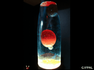
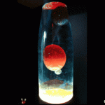
Is this a good use of colour? Honestly, I have no idea. Are the colours used complementary in some way? Should they be? Why are these particular colours used, and why are some colours on top of others—what guided that choice? No clue. All I can go by is what seems pleasing to me, and I do like this one. I think the contrast of the colour and the dark-ish glass is nice, and the colours are spaced in a way that seems balanced.

image

This spoke to me at many levels. It suggested to me it is one thing to notice design elements and another to feel able to say if something is good design. This resonates strongly with my own explorations. Ultimately I too went back to a visceral like/don’t like criterion which is what Donald Norman suggests design is about. He says a small percentage of what we choose as good design is reflective in nature (i.e. we choose  consciously in line with our values) but the majority is visceral, behavioural and unconscious. Good design makes us happy. So, as we see something pleasing, a surge of dopamine hits the brain and generates positive emotion. We cannot explain it with language, but we feel it. 

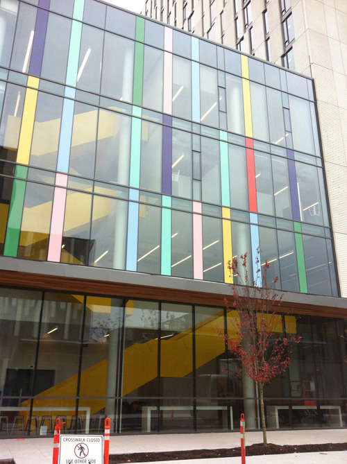
Norman illustrates this in many ways ( the short video is a design safari itself – and great fun to watch) but my favourite example is this:

image

This is Jake Cress’s chair with flaw.

It comes with a short story. This poor little chair knows it is flawed and it is working hard at trying to fix itself. Norman says that what is interesting about this is that we believe the story and are emotionally affected by the object. We like it. I have linked to Jake Cress’s website (click on the photo) – worth a visit if quirky furniture that tells story is your thing. 

This connected for me with the video by Paul Zak during the initial weeks of DS106. There we learnt that increased production of cortisol and oxytocin are found when stories are told that fit Fraytag’s dramatic arc – exposition, rising action, climax, falling action and denouement – and that this makes us behave in ways we may not have chosen to behave before we heard the story. Zak proposes that stories are changing our brain chemistry. In the same way that Norman says our brain chemistry is changed by good design. 

It is a difficult job then for any budding designer to determine how to make people happy so that they like their designs. As I continued to read Ds-ina’s post  I began to see a pattern. Designers are trying to create conscious heuristics or principles that may lead to people’s happiness ( or their emotions being affected in some way)

Ds-ina in her post explores symmetry for example. She quotes this article, 

Symmetrical balance occurs when the weight of a composition is evenly distributed around a central vertical or horizontal axis. Under normal circumstances it assumes identical forms on both sides of the axis. When symmetry occurs with similar, but not identical, forms it is called approximate symmetry.

I had been struggling with the idea of approximate symmetry, but she shows us a photo that explains it beautifully. 

image

People, but not of the same sex or doing the same action! I now get approximate symmetry. What this has done is given a heuristic to understand why I may have a positive emotional reaction – I like it – to this sign. There are many signs that have useful purposes, such as helping us to recycle more, and design principles may or may not be applied to these. Ds-ina’s post goes on to explore some objects and signs as she continues her design safari around her university campus. I encourage you to read her post for a clear and well supported explanation of many principles we covered in design week. I particularly liked her examples about minimalist principles and asymmetrical balance, which for me until I read her post, had been a contradiction in terms. 

As I went further on safari with Ds-ina, it put me in mind of the idea of emotionally intelligent signs. The notion that we are more likely to take action on a sign that appeals to our emotions and particularly signs that are empathetic to our experience such as this one, 

image

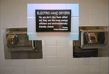
This sign singlehandedly changed my view of electric hand dryers a few years ago.

I then spend several hours watching Objectified again and again. I have mentioned this film in a previous post. It really challenged my views about what makes good design. It goes beyond notions of aesthetics and brain chemistry and makes us stop to think about the intent of design. it suggests that we need to think systemically not individually about design; that non-disposability, and longevity matter; that there is a reality to be faced about how objects that have been thoughtfully designed are just landfill fodder for the future. Many examples and images later, that tell a story of waste and consumption, I am ready to sit up and listen to the suggestion that what Norman calls the reflective level of good design may need much more attention that we give it. Both in object design and in designing our personal cyberinfrastructure. 

I kept going back to Ds-ina’s post and noticing the discomfort she expresses with evaluative criteria that are from the purely personal realm. The whole safari seems a quest for more impersonal criteria against which  design could be judged. I found myself in the same place during design week. I was happy to come back to ‘art in the brain’ as a foundational principle, but something kept nagging at me too. So I explored further the ideas in the film as I felt that an answer might lie beyond the personal and my love for creating ephemeral artefacts. 

I found the seed of an answer in Tim Brown from IDEO talking about design thinking.

I can only say ‘watch it, now!’ But here is his view of what design has become. From,

systems thinkers who were reinventing the world, to a priesthood of folks in black turtlenecks and designer glasses working on small things. As our industrial society matured, so design became a profession and it focused on an ever smaller canvas until it came to stand for aesthetics, image and fashion.

In the world of digital storytelling I guess this equates to using our shiny digital toys to make stuff look good without a thought for the crafting of the story and its place in the wider world. I think that these ideas challenge us to think beyond individual creativity and look systemically to the intent of the storyteller and the actions our stories encourage. 

His answer? Moving away from design and towards design thinking.  He calls for ‘a shift to local, collaborative, participatory design thinking. ’ It suggests a set of design principles grounded not in psychology, not in individual aesthetics, but in community and what David Kelley calls a common ethos of empathy for the consumer. it uses rapid prototyping as a tool that puts potential ideas into the hands of users and gets users to assess value. Kelley says ‘it is not rocket science, it is just empathetic to people’. This is the approach that gave us Apple’s original designs, they worked with Steve Jobs in the early days. This to me has hope. It is defined as ‘human-centered design’. It encourages creative confidence as the ability to ‘to fail often, to succeed sooner’ and as the ability to come up with ideas and having the courage to try them out. This implies to me that what we try does not always succeed, that we should assess this according to an external criteria of how others engage with our designs, and that we need the courage to remove and delete what does not work, and try again. In turn, this requires that we look in the mirror and question our givens – and just why do we like that? The design thinking approach further encourages us to ask: Should we like that? What is the larger purpose that my individual creativity is serving? For some the answer is in social change as in the example of Southwark Circles as a new way to care for the old, for others about open education and using it to teach this approach to design. Yet others want to focus on younger people and how to support them in this kind of thinking. 

If we change brain chemistry and the way people act by the stories we tell, then may be we have a responsibility to press pause and question our intent as storytellers. The wider purposes, our responsibilities as storytellers to ourselves, our communities and the wider systems we belong cannot be ignored when looking at the issue of design principles in digital storytelling. Jonathan Worth may be on to something when he says we have to teach the ‘gravity of the role of the storyteller’. Perhaps there is space to add a week on this topic in future runs of DS106?

I have learnt much and much remains to be learnt.

I take away the need to hold the tension of opposing views as the frontier where new ideas are born and how tough it is to do that without the mind grasping for simple solutions. Thanks, Christina for taking me on such an insightful safari and encouraging me do a second one of my own that has led to deeper insights.

A minimalist poster

image

Design week started yesterday and I could not get my ‘pointy head’ around it. Each week I feel utterly inadequate for a while and then just get on with the work. This time my first assignment choice was the minimalist poster.

I found myself in the same old pattern Seth mentions in his post in relation to this assignment:

I immediately applied my old thinking to the question/problem and nearly dismissed the assignment as super-simple (a bore really)…and then I began to reflect a little. And I found that I couldn’t quite get my pointy head around it.

I too took the day to reflect a little. The usual self-talk kicked in – I am no graphic designer, a stupid idea anyway, what can I learn in a week and I just don’t know how to make a poster anyway. Thankfully I know how to walk beside these patterns rather than own them. I just let the inner self-talk be whilst I watched Helvetica and Objectified and was blown away by amazing designers and their passion for what they do. I found myself falling in love with helvetica and hating it both – depending on the designer I was listening to; understanding that may be I wanted to be a designer all my life, I just did not know it. Somebody in the film says that designers are like doctors. Doctors fight disease and designers fight ugliness. Yes, I have always fought ugliness, I have a deep sense for preserving beauty and elegance in solutions – be it programming, learning design or objects around me. I have always thought of this as an unnecessary quirk, never as a something that could have become a trade. As I listened, I was also made aware of how little I consciously understood about design. What are the criteria that make something beautiful and elegant in my life? 

I then read an article about Google. When asked

what beauty means for Google, they’d eventually settle on an answer that involved the idea of simplicity and, deeper than that, of invisibility.

This resonated with me and brought me back to the poster assignment. It is because simplicity and invisibility seem core criteria for good design to me,  that I was attracted to the poster idea and also to the idea of the 4 icons assignment. Reminding myself once more that as a beginner my taste and execution may not align, I decided to tackle both these assignments as one poster. The rest of this post gives an overview of the process that led to the poster above.

I went for an evening walk with Colin-dog and reflected on favourite movies and the icons that would represent them. I settled on ‘Into the wild’  and selected 4 icons that would tell the story: Alexander Supertramp, the magic bus, big skies, and ‘happiness only real when it is shared’. Clearly, those 4 things told the essence of the story. I started to reflect on how to choose a font that would emote tragedy and impermanence – the futility of a search when life chooses for us. Helvetica was not for that, I thought as I put the key in my front door.

I then came to my computer and started to search for what other people had done. I was surprised that the actual poster for the film had most of the same symbols I had picked. I was surprised to learn that minimalist movie posters are a pastime for many and that others had done beautiful posters for this same film. The arrogance of mind to think itself the discoverer of fire each time an idea occurs…I nearly gave up and just posted the examples I found. They were better than anything i have the skill to produce. But I didn’t give up.

I started to think about layout, about layers in Photoshop, about fonts. I visited what the font with various samples of fonts from the original poster and others. What a great resource, I could spend days just submitting images and get it to generate fonts. In the end I chose Futura as the one that matched best what others had used – I figured they knew better. 

I then remembered one of my favourite photos from visual week and bingo I had my background layer. I wanted big skies but I also wanted the warmth of real skies not just a colour – So Karen’s photo fitted just right. 

I then wanted photos of the magic bus – I thought I might do some inverting or desaturation of the original photo to make it simpler and more ‘minimalist’. I then found this beautiful sketch. It was free to download so i have assumed that the author was giving permission for use. I wanted to have just a hint of the magic bus – so I selected the bus from the sketch. 

I found an animated gif of the final moment in the film when ‘happiness real only when shared’ is written in a book just before the main character dies. I played with that for hour – change the colours, get just one frame, smaller or bigger or…I chose to listen to my gut: It is done, don’t add any more to it. 

So, the 4 items are: the sky, the number 142, the bus and the name he adopts to make his journey – Alexander Supertramp. Anyone who has seen the film would recognise this as iconic of the film, anyone who has not might be curious to see it and cursing me for having spoilt the ending. Apologies for that. 

I learnt about layers, about fonts, about less is more, about how what looks just white to me can be infinite shades of white in Photoshop and, importantly for me, about some of the unconscious criteria that drive my sense of good design. 

But if ‘The act of a safe landing is all the documentation we need’ then my learning will be judged on the poster I produced and not on the documentation of my learning. I wanted just the outline of the bus without the scenery – but I did not know how to erase the background and also keep the boundary lines clean. May be I will improve on it later in the week and see it as work in progress. 

A new version after Feedback and a little help from my friends.

image

Lots of learning but finding patience running thin, I have finally managed to get a version of the poster that looks a little closer to what I had imagined. I am left wondering if a minimalist poster should have curves, but design week is almost over and I have other assignments to complete.

So, tah dah! 

image

I used the magnetic lasso, but failed to select the bus from the original drawing. So, I cheated with clone tool and blur tool to hide (only a little) the flaws in the bus selection. I then used this tutorial to learn how to use the path selection tool and the text tool to get circular text. I would have wanted to get the text following exactly the shape of the bus, but I am now bored with minimalist posters. 

Copyright © 2024 DS106 on the couch

Theme by Anders NorenUp ↑