Today’s daily create asked us to create calming collage. At the same time I saw a tweet from David Kernohan about Sway. A tool to create interactive digital stories from Microsoft. I thought I could make me collage this way to try it.
This shrink is not impressed. I could not preview video in the editor, add music or gifs (though I did not try to upload any of mine). You have little by way of customisation but can tell the system how much stuff matters through the use of focus points and level of importance as it formats. Fonts are very limited.
What is nice? If you just use their content the pre-sort and tags (with hyperlink if you click the image) creative commons content for you. Now this is a winning feature for those of us in a hurry or too lazy to attribute. You can choose how the interactive story is viewed: one page down, one page sideways, one item at a time. You can edit easily within the limits of the tool, all devices friendly helps. It seems, though I did not test, that you can have more than one authors.
Looks like you must have an outlook account to get in, but luckily gifadog already does his email there.
I would use again if I had a written story and just wanted to create a quick transmedia artefact. The no music thing is not great, the number of ways in which you can group things is. It is designed as ‘cards’ that you put in a storyline, easy to learn.
Here is my collage for calm after an hour of using only their content.Scroll down in the embed to view, but looks better on their site.
I am really taken by bot wisdom of late. We did one daily create with @everyadage and I have been following it ever since. I love the nonsensical prompts that almost make sense. A couple of DS106 participants have been playing along with me @JanWeb3 and ds106ronald and we have been taking a few of the adages and making creative edits with the prompts.
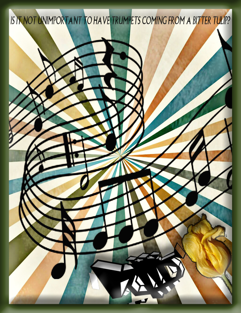
So here is: Is it not unimportant to have trumpets coming from a bitter tulip?
I tried so many possibilities for showing this visually! How do you show a bitter tulip? In the end I settled for shrivelled equals bitter. What background is appropriate? In the end I settled for showing wonderful music coming out of the trumpet being played by the bitter tulip.
The idea here was: Is it not unimportant to have trumpets coming from a bitter tulip when they make such wonderful music?
As it is a saying (we have many sayings in the village) and I used village plain font, I am having it count for a few credits in #prisoner106.
How? All images CC0. I used Photoshop and mainly played with embossing and skew tools. Got texture somehow in the background and made a nice frame for it through render > picture frame.
This was challenging in design and made me play with new tools in Photoshop – had never used skew before. Hard fun! Thank you Ron and Janet for playing!
I am really taken by bot wisdom of late. We did one daily create with @everyadage and I have been following it ever since. I love the nonsensical prompts that almost make sense. A couple of DS106 participants have been playing along with me @JanWeb3 and ds106ronald and we have been taking a few of the adages and making creative edits with the prompts.
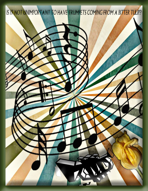
So here is: Is it not unimportant to have trumpets coming from a bitter tulip?
I tried so many possibilities for showing this visually! How do you show a bitter tulip? In the end I settled for shrivelled equals bitter. What background is appropriate? In the end I settled for showing wonderful music coming out of the trumpet being played by the bitter tulip.
The idea here was: Is it not unimportant to have trumpets coming from a bitter tulip when they make such wonderful music?
As it is a saying (we have many sayings in the village) and I used village plain font, I am having it count for a few credits in #prisoner106.
How? All images CC0. I used Photoshop and mainly played with embossing and skew tools. Got texture somehow in the background and made a nice frame for it through render > picture frame.
This was challenging in design and made me play with new tools in Photoshop – had never used skew before. Hard fun! Thank you Ron and Janet for playing!
“A reasonable alternative is to complete a piece that incorporates two different assignments for a sum total of 4 or more Credit Units.”
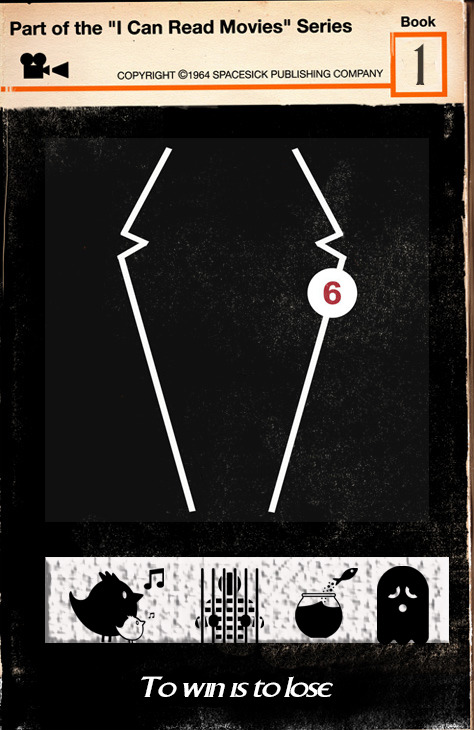
So I did the ‘I can read movies assignment’ and ‘the one story 4 icons’ assignment in one cover. The electricity in my tree house is on for another week as I am clocking 6 Credit units and another 2 for the extra hard work to combine two assignments into one. Although to be fair, I took this on thinking it would be easier than doing two. The new number two is clever with words. A reasonable alternative, indeed. I think I should get an extra 2 Credit Units for doing the whole thing rather than just one episode, but that might be pushing it a bit.
Behind the scenes
I wish I had used my notebook as I intended to keep up with all that I tried. A little like our resident artist futzing was a key ingredient.
I started with the idea that I wanted the cover to embody the sense of ambiguity that is the hallmark of the series. I read an amazing blog post today that spoke about the series as it “constantly offering us a seeming chance for escape, then pulling the rug out from under us.” Nothing is as it appears.
The post explores a Prisoner computer game that never tells you that you can escape the game by pressing the ESC key! The tag line of my cover comes from the end of this game. You win and it tells you: To win is to lose. Sheer genius.
The 4 icons are from our friends at the Noun Project. How awesome are they? I bought them all ‘cause I love supporting their artists.
I have been using their icons in my Prisoner posters series as comas and full stops since this run of DS106 started. It occurred to me that may be the ones I had chosen over time would embody key themes. I was right.
Birds singing seem happy and free, and yet the noise may attract attention when it is not wanted.
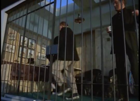
A prisoner in jail might seem a negative icon, yet prison is not always a bad thing. (I will not explain the photo below to avoid spoiler for participants still watching episodes).
The fish escapes the fish bowl and is free then it dies as it lands.
The sad ghost represents death and suffering and yet, if ‘to win is to lose’ may be to lose is to win?
The cover is for book 1 and it contains the story of 6. Hence 6 is 1.
I used Photoshop as usual. Started with one of the covers from the I can read movies series that was cleanest to get a clean black background with the clone tool. I started with a lot more text which disappeared as the 6/1 tension shaped my thinking. I discovered you can search google by ‘type’ of image as well as usage rights and this can find you components to use in a creative edit. The lapels from the jacket came to me that way. I pulled them out of original image roughly with quick selection tool and then added it in with screen blending option to blend in with the grainy black background. My little friend the colour dropper did its job to blend all the colours well. A little blur tool helped me along.
For the first time ever I grouped some layers so that I could line them up properly. The little icons and its background were a group. I used the Emboss Texture blending option to create a rough look to the background.
I feel I have got as close as I can to the essence of what makes this my favourite series of all time. It is to do with the ‘nothing is at it seems nature’ of it. The kind of story that destroys mechanisation by remembering that what makes us human are non-googlable questions such as why. Awesome.
This constant tension is even shown in the way the prisoner dresses. The lapels of the blazer showing that we have a prisoner dressed in a suit, highlighting perhaps that we cannot tell from external cues who is the prisoner and who is the guardian.
Total time spent: several days to get the bits and this afternoon pulling it together. I wanted to challenge myself so I did my best to attend to small details I might ignore in the usual run of things. Cool challenge, Number 2.
“A reasonable alternative is to complete a piece that incorporates two different assignments for a sum total of 4 or more Credit Units.”
So I did the ‘I can read movies assignment’ and ‘the one story 4 icons’ assignment in one cover. The electricity in my tree house is on for another week as I am clocking 6 Credit units and another 2 for the extra hard work to combine two assignments into one. Although to be fair, I took this on thinking it would be easier than doing two. The new number two is clever with words. A reasonable alternative, indeed. I think I should get an extra 2 Credit Units for doing the whole thing rather than just one episode, but that might be pushing it a bit.
Behind the scenes
I wish I had used my notebook as I intended to keep up with all that I tried. A little like our resident artist futzing was a key ingredient.
I started with the idea that I wanted the cover to embody the sense of ambiguity that is the hallmark of the series. I read an amazing blog post today that spoke about the series as it “constantly offering us a seeming chance for escape, then pulling the rug out from under us.” Nothing is as it appears.
The post explores a Prisoner computer game that never tells you that you can escape the game by pressing the ESC key! The tag line of my cover comes from the end of this game. You win and it tells you: To win is to lose. Sheer genius.
The 4 icons are from our friends at the Noun Project. How awesome are they? I bought them all ‘cause I love supporting their artists.
I have been using their icons in my Prisoner posters series as comas and full stops since this run of DS106 started. It occurred to me that may be the ones I had chosen over time would embody key themes. I was right.
Birds singing seem happy and free, and yet the noise may attract attention when it is not wanted.
A prisoner in jail might seem a negative icon, yet prison is not always a bad thing. (I will not explain the photo below to avoid spoiler for participants still watching episodes).
The fish escapes the fish bowl and is free then it dies as it lands.
The sad ghost represents death and suffering and yet, if ‘to win is to lose’ may be to lose is to win?
The cover is for book 1 and it contains the story of 6. Hence 6 is 1.
I used Photoshop as usual. Started with one of the covers from the I can read movies series that was cleanest to get a clean black background with the clone tool. I started with a lot more text which disappeared as the 6/1 tension shaped my thinking. I discovered you can search google by ‘type’ of image as well as usage rights and this can find you components to use in a creative edit. The lapels from the jacket came to me that way. I pulled them out of original image roughly with quick selection tool and then added it in with screen blending option to blend in with the grainy black background. My little friend the colour dropper did its job to blend all the colours well. A little blur tool helped me along.
For the first time ever I grouped some layers so that I could line them up properly. The little icons and its background were a group. I used the Emboss Texture blending option to create a rough look to the background.
I feel I have got as close as I can to the essence of what makes this my favourite series of all time. It is to do with the ‘nothing is at it seems nature’ of it. The kind of story that destroys mechanisation by remembering that what makes us human are non-googlable questions such as why. Awesome.
This constant tension is even shown in the way the prisoner dresses. The lapels of the blazer showing that we have a prisoner dressed in a suit, highlighting perhaps that we cannot tell from external cues who is the prisoner and who is the guardian.
Total time spent: several days to get the bits and this afternoon pulling it together. I wanted to challenge myself so I did my best to attend to small details I might ignore in the usual run of things. Cool challenge, Number 2.
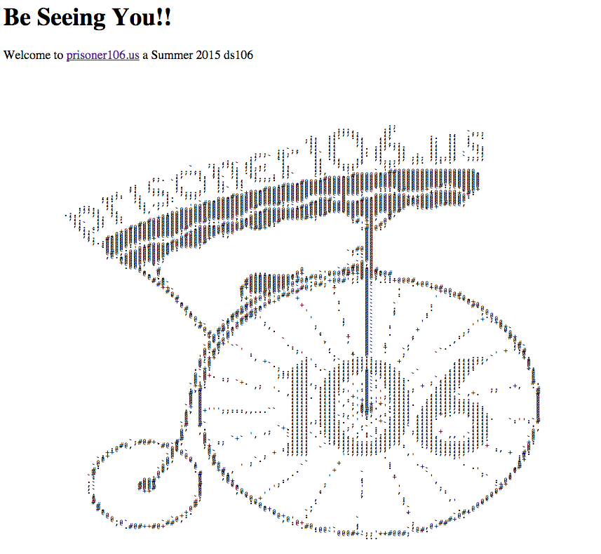
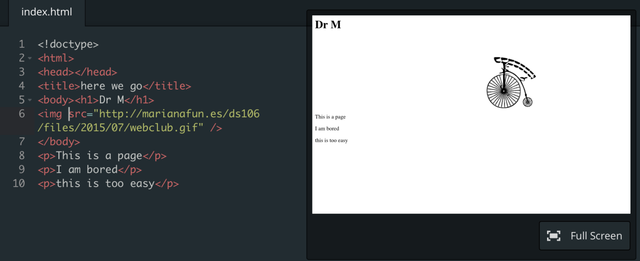
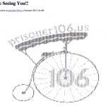
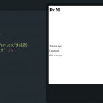
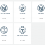
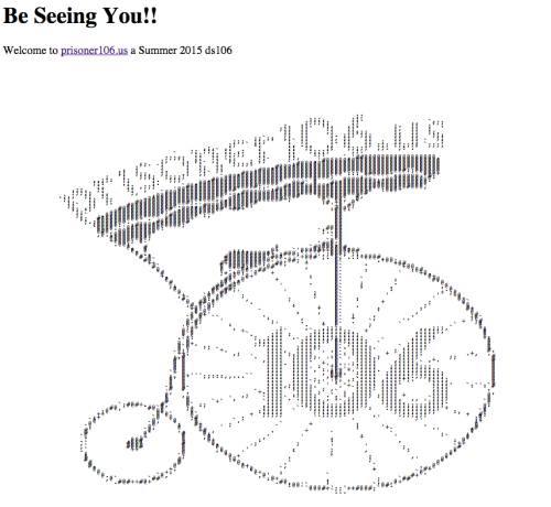
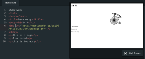
Well, working with the ancient code for The Village web club has led to this shrink going back to basics. I kind of need to do more than just copy and paste code I do not understand, so learning HTML from scratch. Still, my little hideaway under the village is coming along. I even managed to learn how to do strikethrough in ancient code (not trivial as we are working with HTML 3 as I understand it) HT to Christina for pointing me to the Code Academy. It was easy to get started and get going. I want to understand something about the overall structure of a web page, else I am never going to be able to make my village hideaway cosy and comfy.
“I just love his idea of introducing this space as one folks who are creating on the web and pushing to teach themselves new things within a focused community might explore together. It’s fun, it’s personable, it’s focused, and it’s educational!”
Yes, Jim. You are on the money and John is finally getting me to do more than just copy and paste code I kind of understand but not really! Cheers, John!
We could create a text based adventure game underground?
Well, working with the ancient code for The Village web club has led to this shrink going back to basics. I kind of need to do more than just copy and paste code I do not understand, so learning HTML from scratch. Still, my little hideaway under the village is coming along. I even managed to learn how to do strikethrough in ancient code (not trivial as we are working with HTML 3 as I understand it) HT to Christina for pointing me to the Code Academy. It was easy to get started and get going. I want to understand something about the overall structure of a web page, else I am never going to be able to make my village hideaway cosy and comfy.
“I just love his idea of introducing this space as one folks who are creating on the web and pushing to teach themselves new things within a focused community might explore together. It’s fun, it’s personable, it’s focused, and it’s educational!”
Yes, Jim. You are on the money and John is finally getting me to do more than just copy and paste code I kind of understand but not really! Cheers, John!
We could create a text based adventure game underground?